What Flushing Toilets Taught Me About Web Design
At 4/19/2024
I recently traveled through Europe and re-learned an old design lesson from the humble toilet flusher.
Traditionally, toilets had a single control to worry about: the flusher. Some toilets put the flusher on the side of the tank. Others put it on the front of the tank. Some even had a pull cord or a foot pedal.
Regardless of where the flusher was located, the mental model was the same: there was one task you were attempting to achieve (flush) and only one control for you to interact with. It may take a minute to find the flusher, but once you did you could be pretty confident you were using it correctly.
Introducing Dual Flush
This began to change in 1960, when a Japanese company called TOTO designed the first dual flush toilet. For hundreds of years people had been using single flush toilets, but as toilets became more prevalent and resources became more scarce, an old constraint became more and more important: toilets use a ton of water.
The exact numbers vary, but depending on how a toilet is being used, a standard flush is often more water than necessary. Dual flush toilets work around this by giving the user an option: they can choose the standard flush or a smaller flush. This allows more control over how much water is used and how much is conserved. The dual-flush toilet is now universally adopted in many countries, and I saw them frequently in Europe.
A Yankee Goes to the Loo
This is a big win for water conservation, but there’s a problem: the flushing controls are confusing! These toilets have started to be introduced in the US, but they’re still not common, and trying them out in Europe I was often confused about how to trigger the correct flush. There are a variety of designs, some of which are clearer than others.

Unfortunately, the most common design I saw was one of the most confusing. It uses two buttons overlaid inside a circle. The specific size and placement of these two buttons varies considerably, but generally the larger button flushes more water, while the smaller button flushes less.

This makes sense once you’re used to the concept, but it isn’t obvious if you’re not. Even once you understand the different sizes of buttons, these can still be confusing:
- You’re often comparing the size of two different shapes: for example, a crescent vs. a circle. This can be tricky to do at a glance if they’re similarly sized.
- Sometimes the smaller button is narrower than your fingertip.
- Sometimes clicking one of the buttons presses both down at once.
Fixing the Flusher
This overlaid button design looks elegant but can make these toilets tricky to understand and use. This is a classic case of form over function, where the visual design of something is prioritized over usability. By making a few simple changes, we can make it clearer for users unfamiliar with the design.
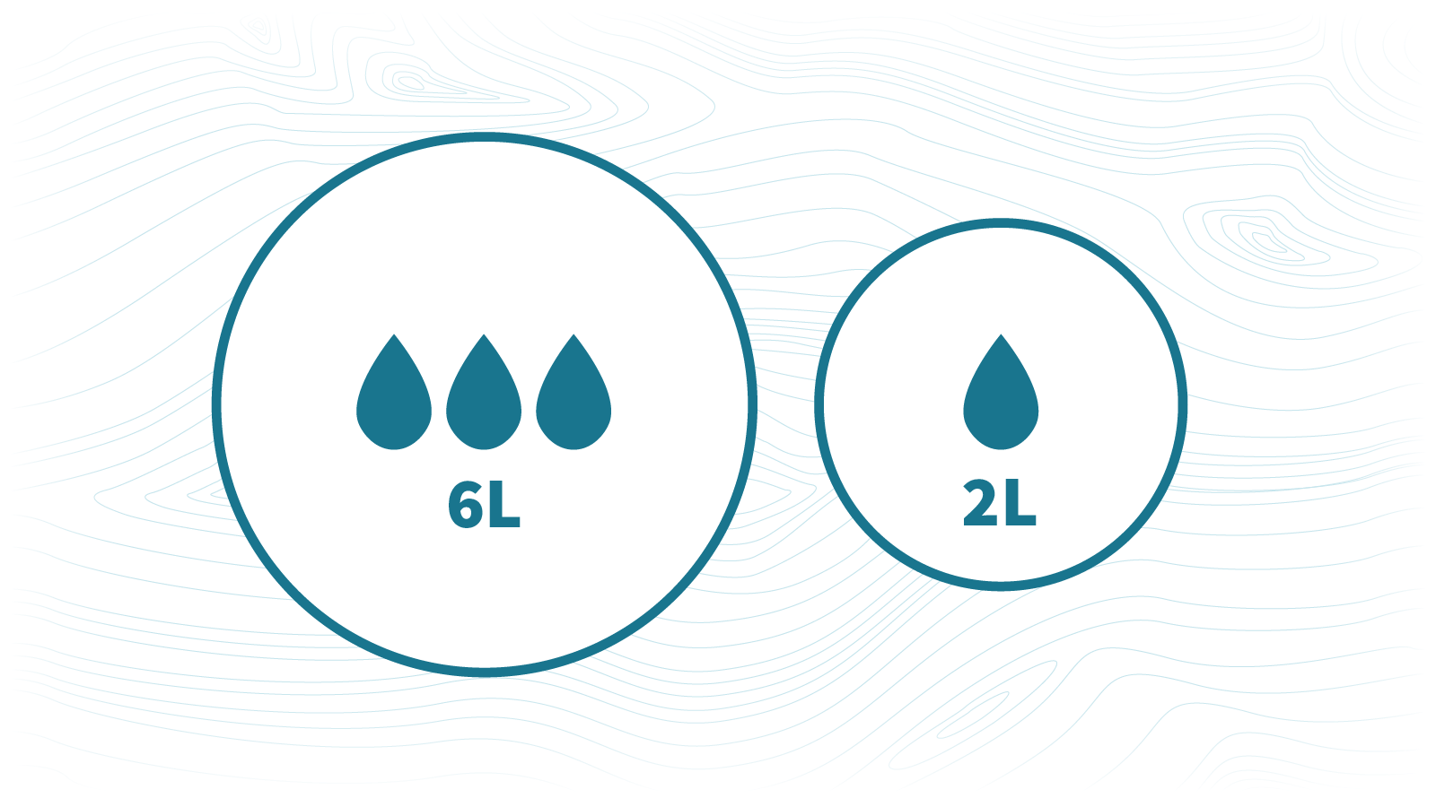
- Add icons: Icons can add visual meaning to the buttons. For example, 💧 vs 💧💧💧 clearly symbolizes the difference in water used.
- Add words: Words add even more meaning but are harder to translate. Numbers and common unit abbreviations (e.g. “6L” vs “2L”) are more likely to translate across languages. (I’m not sure how much water is actually used to flush.)
- Space out the buttons: Adding space between buttons makes it easier to press one without pressing the other.
- Make the buttons bigger: The small button could be difficult to tap. It should be at least as wide and tall as a finger tip. Probably bigger.
- Make both buttons circles: Shape can convey meaning, but it’s not clear what the different shapes mean here. We should remove differences that don’t convey meaning, since they can be distracting.
The Final Flusher

By applying these design changes we can create a much easier to understand toilet flusher. I’ve seen some flushers incorporate some of these changes, but haven’t seen any that incorporate all of them.
What does this have to do with the web?
This post started out as a rant to my girlfriend about the toilet in our short term rental flat, but as we chatted I realized I was talking about a lot of the same design challenges I deal with at work. By using words and icons together, putting space between interactive elements and applying minimum touch sizes, and removing unnecessary distractions we can make the interfaces we design easier to understand and use.
When you’re designing a tool someone needs to use — whether it’s a toilet flusher or a checkout form — make it elegant. But more importantly, make it easy to use and understand.
