Traditional Web Design Process is Fundamentally Broken
At 4/19/2024

Responsive design broke the traditional web design and development process in fundamental ways. Despite this fact, many organizations continue to use this broken process.
The traditional web design process looks something like this:

We start with some planning. Then someone creates wireframes and mockups. When we’re happy with the mockups, they’re handed off to developers who convert them into HTML, CSS and JavaScript. Finally, after a lot of work, the web experience launches.
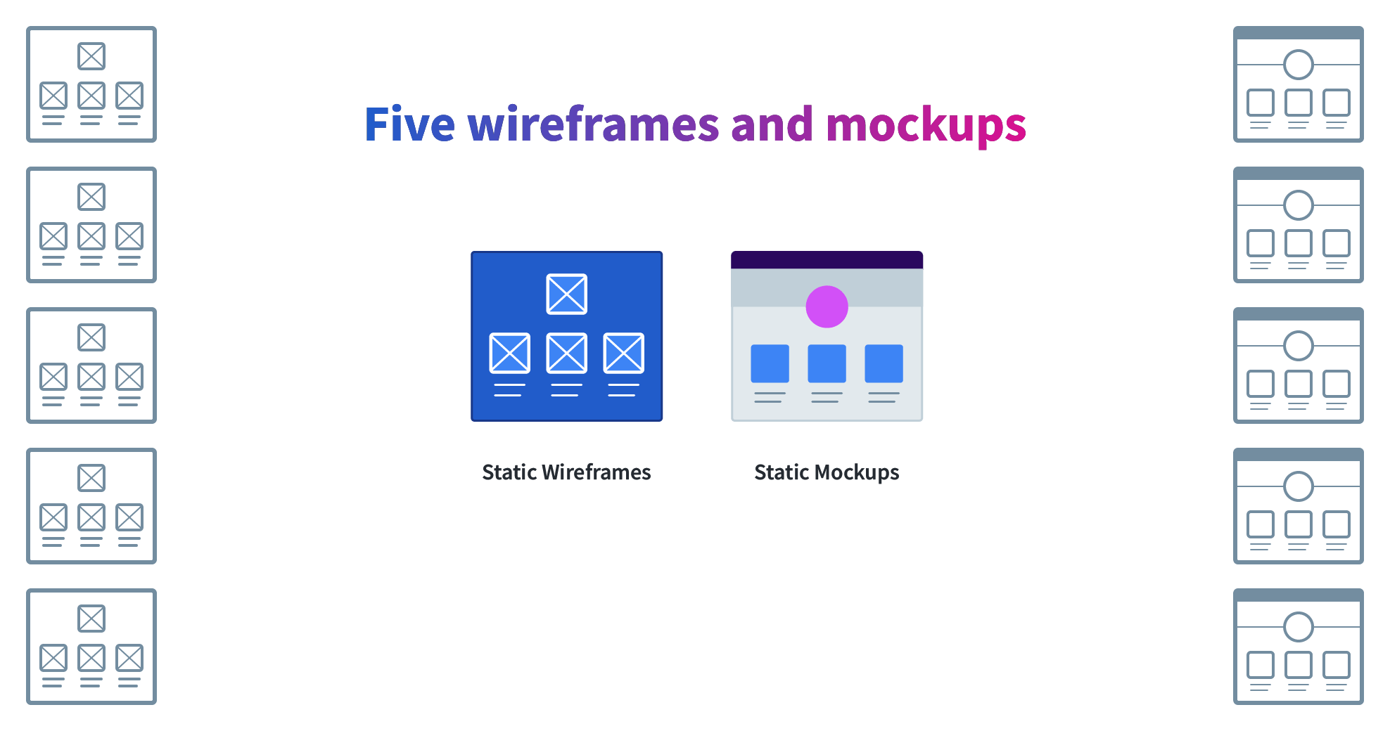
To understand why this process is broken, let’s focus in on two stages—wireframes and mockups—for a hypothetical site with five templates.
We’ll need a wireframe and static mockup for each of the five templates.

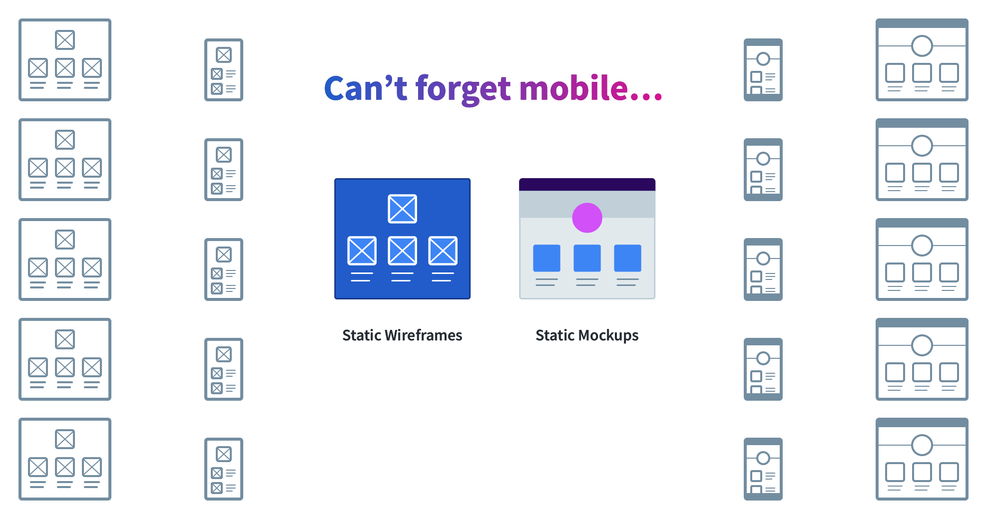
And we can’t forget mobile so we’ll need mobile wireframes and mockups too:

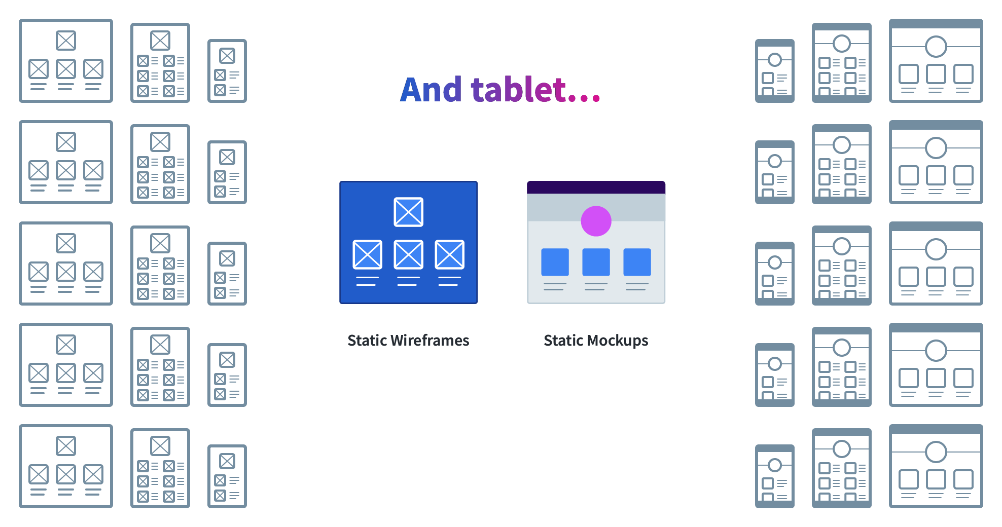
And tablets:

And it is hard to imagine a web site design without at least one round of revisions:

At this point, we have sixty artifacts in a best case scenario. What are the chances that the designs only require one round of revisions?
Worse, the designs are misleading. There is no one size for mobile, tablet, or desktop. Current generation iOS devices account for thirteen breakpoints on their own. These static wireframes and mockups leave to the imagination any screen sizes other than the three specified.
This is the worst of all worlds—a waterfall process creating dozens of artifacts, none of which accurately capture how the design will look and behave in the browser.
Next time, we’ll look at what happens to those in-between screen sizes when static designs are handed off to development.
This article is part 1 of a series on design tools in a design system world:
- Currently Viewing:Traditional Web Design Process is Fundamentally Broken
- Design Happens Between Breakpoints
- Faulty Assumptions and Unwanted Features of Most Web Design Tools
- Responsive Design Process that Works
- Web Design Tool Wish List
- [Coming soon]
