Solved: Tricky Floating Image Alignment
At 4/19/2024
If you want to pair an image alongside some text content in CSS, you have a few options.
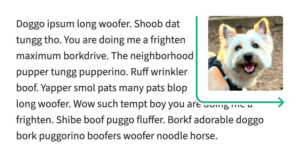
You can float the image left or right. Any text that extends past the image will naturally flow beneath, which is neat. But if the text is shorter in height than the image, you get an Oklahoma Panhandle effect with one big corner of negative space.
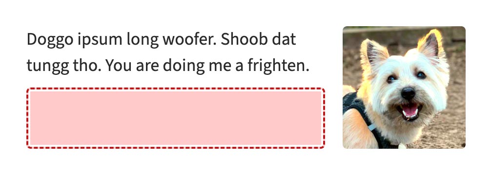
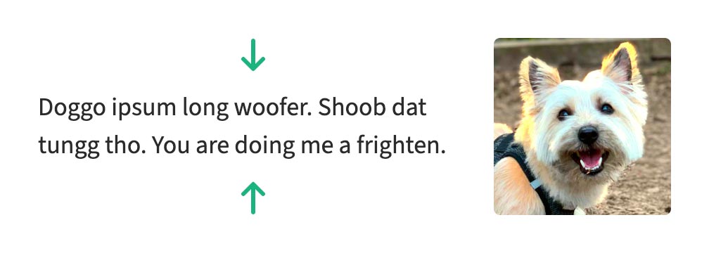
Instead, you might set a containing element’s display to grid or flex, arranging the image and text in their own columns. This gives you much finer control of alignment, so you can vertically center the text content until it overflows. Unfortunately, that overflow will never flow beneath the image, which makes it less space efficient.
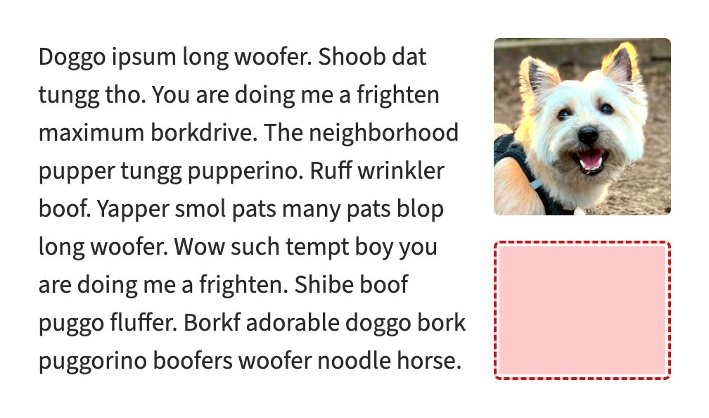
Ideally, we’d combine these two alignments: The overflow behavior of float, with the alignment behavior of grid or flex. Surely that would require some newfangled CSS involving container query units or scroll-driven animation wizardry?
It turns out, we can pull this off using a clever combination of properties that browsers have supported for a long time.
Solution
Here’s a demo of the solution in action. You can edit the content directly (thanks to contenteditable), or use the buttons to shorten or lengthen the text content.
This is the relevant HTML:
<div class="media">
  <div class="media__inner">
    <img class="media__object" src="…" alt="…" width="…" height="…">
    <div class="media__content">…</div>
  </div>
</div>Code language: HTML, XML (xml)
Which we style with this CSS:
.media {
  display: grid;
}

.media__object {
  float: right;
  margin-left: 1em;
}

.media__content {
  position: relative;
  top: 50%;
  transform: translateY(-50%);
}Code language: CSS (css)
(You may want to replace physical direction properties and keywords above with equivalent logical properties, depending on your project and audience.)
How it works
This bonafide CSS trick involves the following elements:
.media: The outer wrapping element, which establishes a grid. This clears floats, establishes a new stacking context and, most crucially, resolves the container height for relative positioning (more on that later)..media__inner: The inner wrapping element. Grid items can’t float, which is why we have to nest our floating image and adjacent content two elements deep. The class name is optional since this has no styles of its own..media__object: The image, floating to the right..media__content: The content, which flows around the image. We offset its position to achieve the alignment effect.
How does the content alignment change dynamically?
The .media__content class has two different positioning rules applied to it:
- A combination of
position: relativeandtop: 50%shifts the content down by half the height of the parent element. translateY(-50%)shifts the content back up by half its own height.
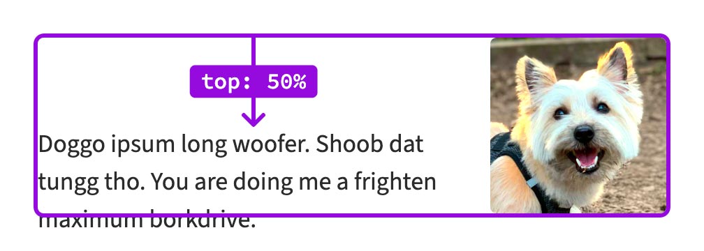
top.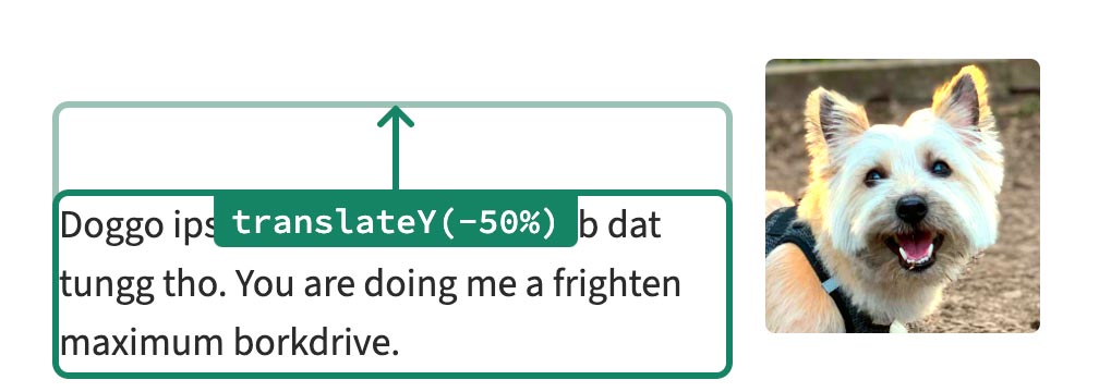
transform.When the text content is shorter than the image, it will also be shorter than the container. By extension, the offset that uses translateY will be smaller than the offset using top, resulting in the content centering itself vertically.
But when the text content is tall enough to flow around the image, then the containing element will have stretched to match its size. This means the offsets will be equivalent, canceling each other out.
Why grid?
For this to work, top: 50% needs to be relative to the parent element, including its children (floating or otherwise). I tried a bunch of techniques for creating new stacking contexts, and setting the display to grid or flex were the only ones that seemed to work for this scenario. I chose grid since it’s very well-supported and requires no additional styles.
Any drawbacks?
This technique doesn’t play well with the shape-outside property when the content is shorter. (That’s a bummer for circular images.) It’s also a shame that the grid wrapper is required.
CSS is still awesome
I think it’s pretty neat that in this era of rapid development of CSS standards, there are still novel combinations of long-stable properties to discover.
Huge thanks to Vesa Piittinen for suggesting the original solution and granting me permission to write about it. Thanks also to Miriam Suzanne for confirming when I was barking up the wrong tree, to Nicole Sullivan for inventing the media object pattern I used in this demo, and to Buster for being a very good boy.
