Responsive Images 101, Part 3: Srcset Display Density
At 4/19/2024
Ever since Apple launched a retina display on the iPhone 4, web designers have been looking for a way to handle high density displays. That is where srcset and its display density descriptors come in.
Resolution switching uses srcset
As a reminder, display density is a resolution switching use case. And when we’re solving for resolution switching, we want to use srcset.1
The reason why we want to use srcset is because it gives the browser choice. When we use the media attribute provided by the <picture> element, we’re dictating to the browser what image it must use. That makes sense for art direction.
But when it comes to resolution switching, the browser knows best what image will work. It can make decisions based on factors that we’re not privy to such as network conditions or user preference.
So unless we are doing art direction, we should strive to give the browser options and let it make smart decisions.
Display density descriptors
The syntax for display density is fairly straight forward:
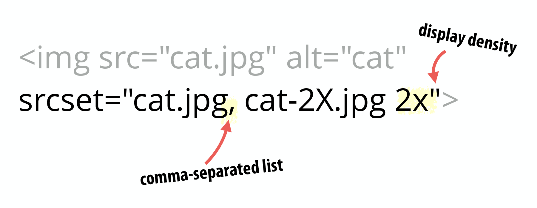
The srcset attribute is added to an <img> element. The value of srcset contains a comma-separated list. Each item in the list contains the path to an image and the density of that image provided as a multiple (e.g., 1x, 2x, 3x…).
<img src="cat.jpg" alt="cat" srcset="cat.jpg, cat-2X.jpg 2x">
Code language: HTML, XML (xml)
The display density values—the 1x, 2x, etc.—are referred to as display density descriptors. If a display density descriptor isn’t provided, it is assumed to be 1x.
That seems easy…
It is easy—assuming all you care about is display density. I have my doubts about how often that will happen.
Let’s take a look at the Apple Watch image from Part 1:

As mentioned previously, the image is 5144×1698 pixels and 398K in its 2x incarnation. There is also a 1x version. Let’s compare them to the size that would make sense for a single density, Blackberry Curve 9310:
| Image | Width | Height | File Size |
|---|---|---|---|
| 2x large | 5144 | 1698 | 398K |
| 1x large | 2572 | 849 | 256K |
| 320px, Single Density | 320 | 106 | 8K |
For the final row in the table, I resized the image to 320px wide and saved as a JPEG in order to estimate what it would be.
It should be obvious that two sizes of an image aren’t sufficient. Sure, we could start at 320 as 1x and then rewrite our markup to look something like this:
<img srcset="cat.jpg, cat-2X.jpg 2x, cat-3x.jpg 3x, […], cat-16x.jpg 16x">
Code language: HTML, XML (xml)
That will get us from 320px to the 5144px of the largest image, but it seems insane to me.
And this highlights another reason why I find the display density descriptors to be less desirable than other solutions. I don’t have any interest in keeping track of all of the different display densities available.
Do we want to provide 1x, 1.5x, 2x, 3x variants? What about accounting for things like the iPhone 6 Plus’s downsampling?
Not to mention what happens when you start working with flexible images. Now you have multiple densities at multiple image breakpoints. And sometimes you’re repeating your image sources because 2x at a small size could be the same as 1x resolution at a larger image breakpoint.
It gets messy quickly.
Display density descriptors are best for fixed width images
The moment you move beyond providing alternate densities of a fixed width img element, the display density descriptor becomes unwieldy and inadequate to the task.
What do you need instead? Part 4: Srcset Width Descriptors.
Responsive Images 101 Series
- Definitions
- Img Required
- Currently Viewing:Srcset Display Density
- Srcset Width Descriptors
- Sizes
- Picture Element
- Type
- CSS Responsive Images
- Image breakpoints
- Conclusion
Footnotes
- Unless we’re providing different image formats which we will cover later.

