
Responsive Design Process that Works
At 4/19/2024
A few years ago we faced a conundrum. We want to design responsive experiences, but our old way wasn’t scaling. We were producing too many artifacts, and what we produced didn’t represent the end product well. We had to find a better way.
It took some time and some experimentation, but we eventually settled on a new process that has worked incredibly well. We’ve used this process to solve a wide range of design problems ranging from marketing websites to complex web applications.
Responsive Design Sprints
The specific parts of our process vary depending on the project, but the core engine remains the same: a responsive design sprint.
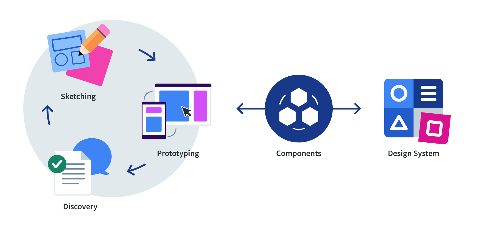
We start with discovery for the patterns we’re designing during the sprint. We then sketch small screens. Small screens are a useful constraint. If you’ve made your life fit in a tiny home, you won’t have any trouble fitting it into a house in the suburbs, but going the other direction is a challenge.
After sketching we move directly into code. You can call this step prototyping, in-browser mockups, or web-based mockups. We’ve used all of those terms at one point or another. What matters is that we’re designing responsive from the beginning because we’re designing in the medium of the web.
Once an in-browser mockup is approved, we determine what portions of that design should be made into components. When we create components, we consider accessibility, performance, browser support, maintainability, reuse, best practices—all the things we can ignore in the quick prototypes.
We codify those components and document them in a design system. Every component that we create speeds up the design process because it can be used as a building block for subsequent prototypes.
A Better Process
I’m not here to say that we’ve found the one true web design process. Every organization is different. But I can confidently say this process is demonstrably better than the traditional web design process. Here are three examples of how the process results in better designs.
Designs have greater integrity
I often encounter responsive designs that break at various screen sizes. The content will break out of its container because it is fixed width in a responsive layout. Or the content will stretch in ways that is no longer readable. There are sites that I visit frequently that I now know I have to flip my device or change my browser window if I want a good experience.
This is what I mean by integrity. The design may look good in general, but as you resize the browser, you start to see the design break apart.
In a responsive design sprint process each smaller components has been thoughtfully designed and is fully responsive.
Because these smaller pieces are fully responsive, when you start building full pages, you find that the pages don’t break down. The page is fluid because every piece of the page is fluid as well.
Solve problems you can’t see in static mockups
When we were working with Walmart to make their grocery site responsive, one of the most important and difficult screens to make responsive was the book time slot interface. This interface presented customers with a table of delivery times to chose from.

Fitting all of this content onto a small screen while increasing the size of most of the elements to make them touch friendly was a challenge. It required reconsidering the information priority and density to make it all fit.
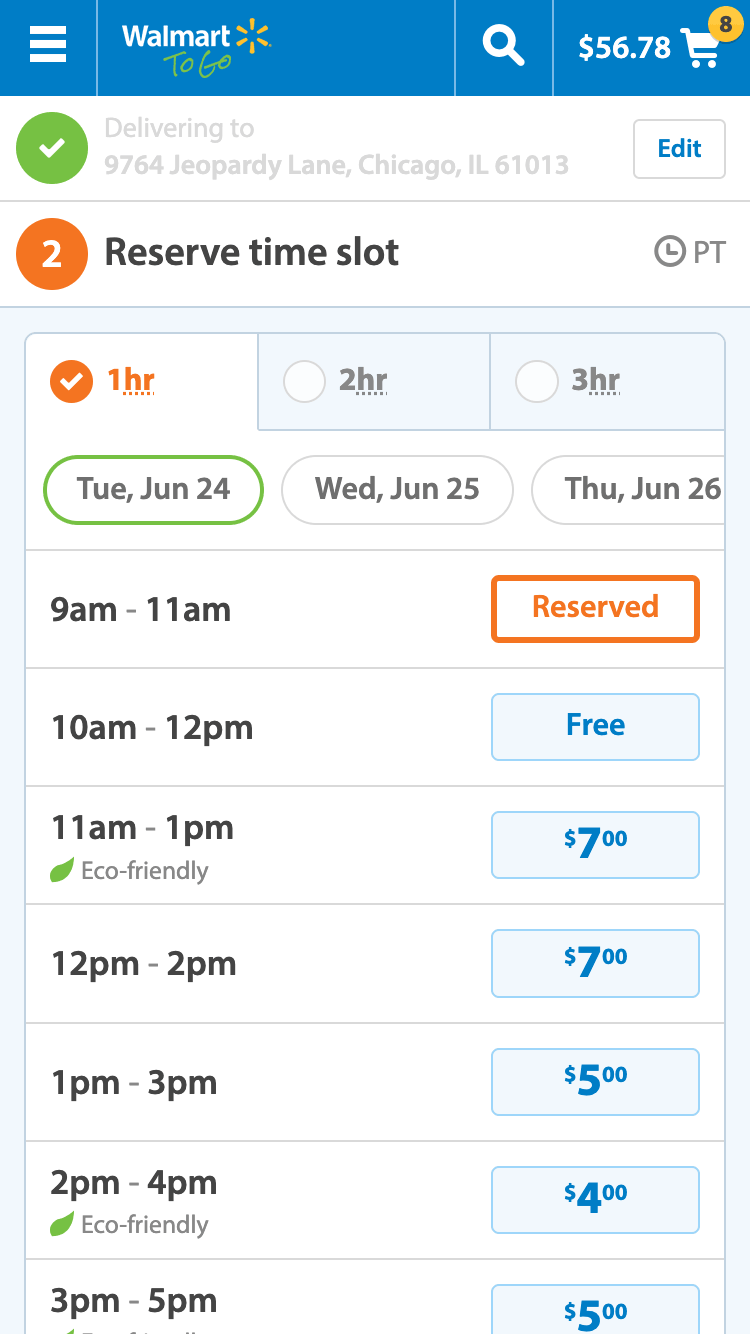
Everything looks great as a static image. Fortunately, we had an in-browser mockup to play with. Once we created a link to go to the next day’s time slots, we discovered a problem.
The experience of moving from one day to the next was jarring—particularly in cases where one day had a lot of time slots and the subsequent day had few. There was little feedback provided to help users orient themselves.
Sometimes it was clear something had changed, but because the page length was different, you were suddenly teleported to a different area of the page not knowing what happened. Other times, you’d catch prices and time slots changing, but they would change so quickly that you weren’t certain what had happened.
The interface looked good on paper, but the actual experience didn’t work. We needed to provide a way to orient users to what was happening. We used animation to make it clear. It took quite a bit of experimentation, but we finally found something that worked.
What I love most about this animation is how it just feels right—like it should always have worked this way—and yet I know how many iterations it took to get it to feel natural. In fact, it isn’t one animation. It is several. I’ve slowed it down in the video below so you can see the multiple transitions at work.
If we had only be designing static mockups, not only would we have had trouble figuring out the best combination of animations, but we wouldn’t have even known we had a problem to solve to begin with. Instead, we ended up with an in-browser mockup that showed the full responsive experience including these critical animations.
Handoff with Responsive Problems Solved
Even in this process, we still have handoffs. Sometimes we’re handing the prototypes off to developers who are codifying the components in a design systems. Sometimes it is developers on our team or the client’s who will implement the design in the end environment.
Handoffs can still have complications. But they are much fewer than when we’re working with static mockups because developers can see exactly how something is supposed to work.
With this process, the majority of the responsive design problems have been solved in the in-browser mockups we hand off. This happens because we’ve been designing responsively, in the medium of the web, from the beginning.
The Secret Sauce
We believe so much in this process that we evangelize it to others in presentations and workshops. We’ve been fortunate to have clients who wanted to learn the process and who work alongside us or embed in our team.
And we’ve been successful doing this even when some of the client designers cannot create in-browser mockups themselves. They take screenshots of the prototypes and then modify them in their design tool of choice. The key is collaboration and refining ideas quickly.
Unfortunately, our process isn’t always a good fit for other organizations. We have a bit of an advantage when it comes to operating in this way:
Our designers code and our developers went to art school.Footnote 1
I realize the subject of designers coding is a bit of a heated topic. I don’t hold a dogmatic perspective on this issue, but in my ideal world, yes, designers would be able to code. And developers would be able to design. In fact, in my ideal world, everyone knows how to code and design.
But I’m also realistic. There are amazing designers we’ve worked with who cannot code. There are phenomenal developers who don’t have an eye for design. My ideal world doesn’t exist.
What we need are design tools that can get us closer to the responsive design sprint process so that every designer—whether than can code or not—can participate in it.
What would a design tool look like that did that? More on that next time.
This article is part 4 of a series on design tools in a design system world:
- Traditional Web Design Process is Fundamentally Broken
- Design Happens Between Breakpoints
- Faulty Assumptions and Unwanted Features of Most Web Design Tools
- Currently Viewing:Responsive Design Process that Works
- Web Design Tool Wish List
- [Coming soon]
Footnotes
- It is no longer strictly true that 100% of our developers went to art school, but they all have design sensibilities. Return to the text before footnote 1