Progressively Enhanced Form Validation, Part 4: Custom validation messages
At 4/19/2024

Part 1 of this series explored the browser’s built-in HTML and CSS form validation features. Part 2 enhanced the experience by layering in JavaScript using the Constraint Validation API. Part 3 dug into custom validation handling for a checkbox group leveraging the FormData API.
This article explores the ValidityState API, a powerful, approachable, and well-supported API we can use to define custom validation messages.
Feel free to view the demo for this article as a reference. The source code is available on GitHub.
Join along as we explore the following in this article:
- ValidityState API overview
- Let’s add more demo fields
- Adding custom validation messages
- Updating the demo to use custom validation messages
- What about localized validation messages?
I’m excited, let’s jump in!
ValidityState API overview
The ValidityState API gives us access to an object containing all the states for an input represented as read-only boolean properties with respect to the input’s native validation constraints.
You can find a list of all instance properties on MDN. Below are the ones we’ll use in this demo:
badInput: Istruewhen the browser is unable to convert the value (e.g., a non-numeric value in a number input)patternMismatch: Istrueif the value doesn’t match thepatternattribute regular expressionrangeOverflow: Istrueif the value is greater than themaxattributerangeUnderflow: Istrueif the value is less than theminattributestepMismatch: Istrueif the value doesn’t conform to thestepattributetooLong: Istrueif the value length exceeds themaxlengthattributetooShort: Istrueif the value length is less than theminlengthattributetypeMismatch: Istrueif the value format doesn’t match thetypeattribute (whentypeis"email"or"url")valueMissing: Istruewhen therequiredattribute is present and no value is providedvalid: Istruewhen all input validation constraints are satisfied,falseotherwise
To better understand the API, let’s look at an example. If we have an email input with type and required validation constraints:
<input
  id="customer-email"
  name="customerEmail"
  type="email"
  required
  aria-described-by="customer-email-error"
/>
Code language: HTML, XML (xml)
We can use JavaScript to access the input’s validity property to get the ValidityState object:
const inputEl = document.getElementById('customer-email');
console.log(inputEl.validity);
Code language: JavaScript (javascript)
Which logs the following:
{
  badInput: false;
  customError: false;
  patternMismatch: false;
  rangeOverflow: false;
  rangeUnderflow: false;
  stepMismatch: false;
  tooLong: false;
  tooShort: false;
  typeMismatch: false;
  valid: false;
  valueMissing: true;
}
Code language: JSON / JSON with Comments (json)
You’ll notice the valid property is false and the valueMissing property is true. This means the field value is empty and fails the required validation constraint. If we were to satisfy the required constraint by entering an invalid email value, say “asdf,” the ValidityState object would update as follows:
{
  badInput: false;
  customError: false;
  patternMismatch: false;
  rangeOverflow: false;
  rangeUnderflow: false;
  stepMismatch: false;
  tooLong: false;
  tooShort: false;
  typeMismatch: true;
  valid: false;
  valueMissing: false;
}
Code language: JSON / JSON with Comments (json)
Above, the valueMissing property is now false (the required constraint is now satisfied), but the typeMismatch property flipped to true because “asdf” does not satisfy the type="email" validation constraint. The valid property is still false.
And that’s it! We were just handed the critical piece to the puzzle.
Accessing an input’s ValidityState object is the key to providing custom, more accessible validation messages, enhancing the user experience over the default generic messages that may not be WCAG-compliant.
customError property?
What is the customError property?
You’ll notice there is a customError property that we’re not using in the ValidityState object. The customError property is true if a custom validation message is specified using the setCustomValidity method. Combined with the reportValidity method (which we don’t want to use), the built-in error message bubbles can be customized. Since we’re using a more accessible custom design for our validation messages, we don’t need to worry about the customError property and related methods.
Let’s add more demo fields
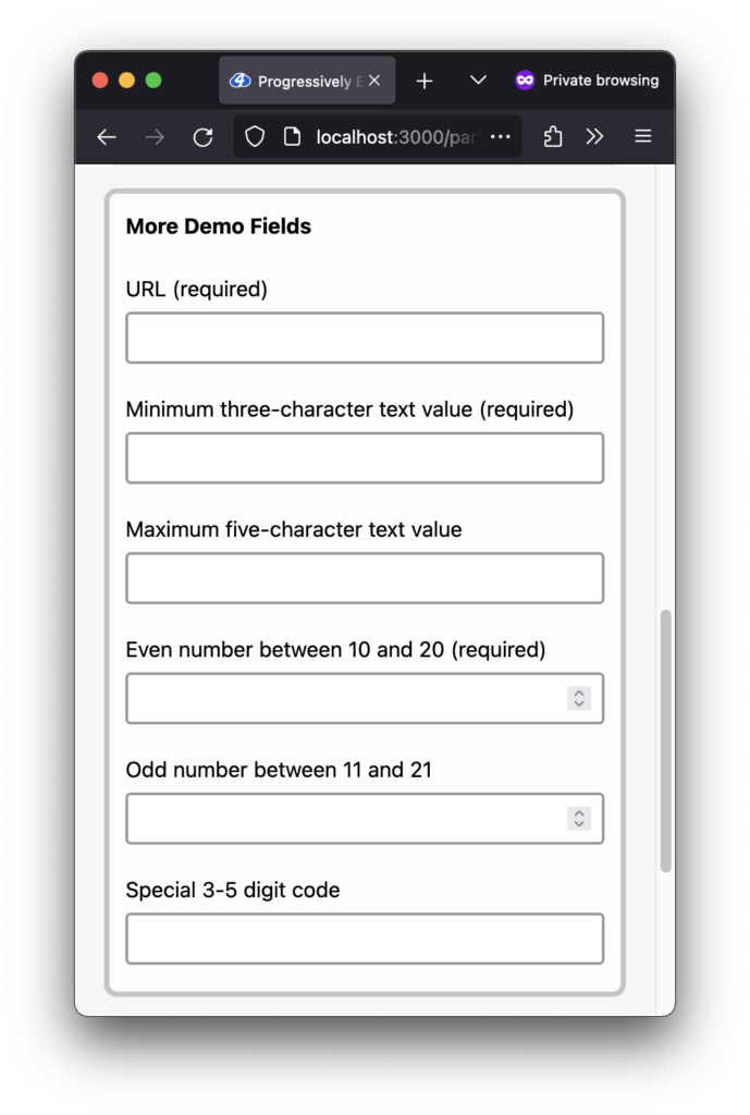
We can add more demo fields to see different ValidityState properties in action. Below are the input fields I added to the demo…
URL:
<input
  name="demoUrl"
  type="url"
  required
>Code language: HTML, XML (xml)
Minimum three-character text value:
<input
  name="demoTooShort"
  type="text"
  minlength="3"
  required
>Code language: HTML, XML (xml)
Maximum five-character text value:
<input
  name="demoTooLong"
  type="text"
  maxlength="5"
>Code language: HTML, XML (xml)
Even number between 10 and 20:
<input
  name="demoRangeEven"
  type="number"
  min="10"
  max="20"
  step="2"
  required
>Code language: HTML, XML (xml)
Odd number between 11 and 21:
<input
  name="demoRangeOdd"
  type="number"
  min="11"
  max="21"
  step="2"
>Code language: HTML, XML (xml)
Special 3-5 digit code:
<input
  name="demoPattern"
  type="text"
  pattern="[0-9]{3,5}"
  minlength="3"
  maxlength="5"
>Code language: HTML, XML (xml)
All of the new demo fields were added inside a new “More Demo Fields” fieldset:

Adding custom validation messages
Let’s create a new function, getValidationMessageForInput, to handle the custom validation message logic. It will accept an input element as the only argument and return a string:
/**
 * Returns a custom validation message referencing the input's ValidityState object.
 * @param {HTMLInputElement} inputEl The input element
 * @returns {string} A custom validation message for the given input element
 */
const getValidationMessageForInput = (inputEl) => {
  // Custom validation message logic will go here.
}Code language: JavaScript (javascript)
To start with, we can return an empty string if the input’s ValidityState valid property is true:
const getValidationMessageForInput = (inputEl) => {
  // If the input is valid, return an empty string.
  if (inputEl.validity.valid) return '';

  // The rest of the custom validation message logic will go here.
}
Code language: JavaScript (javascript)
For the rest of the custom validation message logic, we can consider a couple of different patterns. The first is to organize the messages by ValidityState property, for example, for the valueMissing property:
const getValidationMessageForInput = (inputEl) => {
  // If the input is valid, return an empty string.
  if (inputEl.validity.valid) return '';

  if (inputEl.validity.valueMissing) {
    return 'Please enter a value';
  }

  // The rest of the custom validation message logic goes here.
}
Code language: JavaScript (javascript)
While perhaps the most straightforward, this pattern is more limiting because we cannot craft field-specific messages; they will feel too generic. Let’s add an extra conditional check to organize them by input field name instead.
Using the customerEmail example from above, we can do something like this:
const getValidationMessageForInput = (inputEl) => {
  // If the input is valid, return an empty string.
  if (inputEl.validity.valid) return '';

  /**
   * Customer email validation constraints:
   * - required
   * - type=email
   */
  if (inputEl.name === 'customerEmail') {
    if (inputEl.validity.valueMissing) {
      return 'Please enter an email address. (This field is required.)';
    }
    if (inputEl.validity.typeMismatch) {
      return 'Please enter a valid email address.';
    }
  }

  // The rest of the custom validation message logic goes here.
}

Code language: JavaScript (javascript)
Better! This pattern gives us the flexibility to write unique validation messages for each input field’s specific ValidityState property, for example:
/**
 * Purchase date validation constraints:
 * - required
 * - type=date
 * - min
 * - max
 */
if (inputEl.name === 'purchaseDate') {
  if (inputEl.validity.valueMissing) {
    return 'Please enter a purchase date. (This field is required.)';
  }
  if (inputEl.validity.typeMismatch) {
    return 'Please enter a valid purchase date.';
  }
  if (inputEl.validity.rangeUnderflow) {
    return 'The purchase date must be within the last calendar year.';
  }
  if (inputEl.validity.rangeOverflow) {
    return 'The purchase date cannot be a future date.';
  }
}
Code language: JavaScript (javascript)
If we don’t want unique validation messages for each ValidityState property, we can collapse multiple property checks into a single conditional and return only one validation message:
/**
 * "Odd number between 11 and 21" validation constraints:
 * - type=number
 * - min
 * - max
 * - step
 */
if (inputEl.name === 'demoRangeOdd') {
  if (inputEl.validity.valueMissing) {
    return 'Please enter a number. (This field is required.)';
  }
  if (inputEl.validity.badInput) {
    return 'Please enter a valid number value.';
  }
  if (
    inputEl.validity.rangeUnderflow ||
    inputEl.validity.rangeOverflow ||
    inputEl.validity.stepMismatch
  ) {
    return `The value should be an odd number between ${
      inputEl.getAttribute('min')
    } and ${
      inputEl.getAttribute('max')
    }.`;
  }
}
Code language: JavaScript (javascript)
You’ll notice you can even use the literal input attribute values within the validation messages if it makes sense, as I did above, using the input’s min and max attribute values:
return `The value should be an odd number between ${
  inputEl.getAttribute('min')
} and ${
  inputEl.getAttribute('max')
}.`;
Code language: JavaScript (javascript)
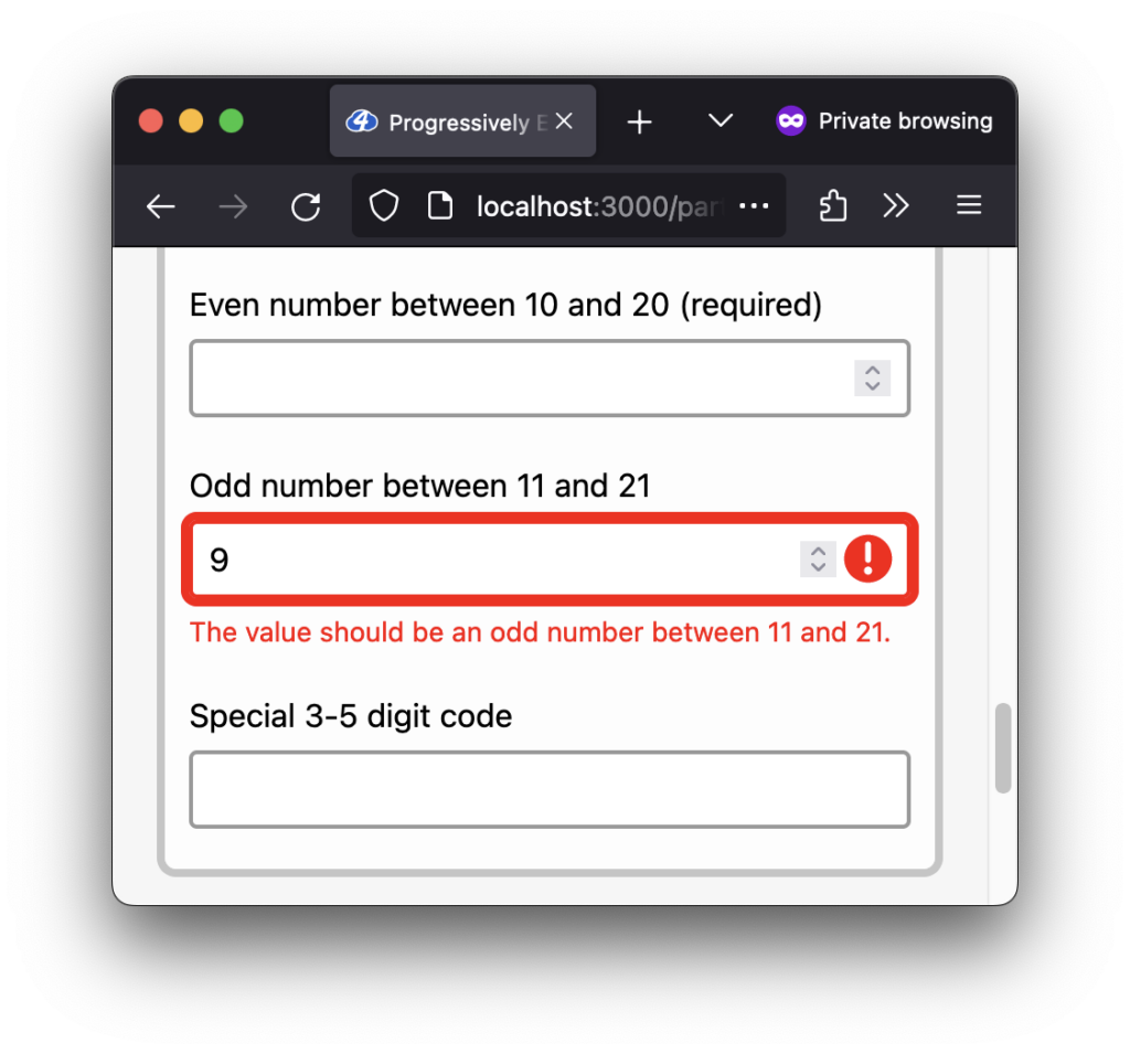
This would generate the following validation error message:
The value should be an odd number between 11 and 21.

min, max, or step validation constraints, the validation message “The value should be an odd number between 11 and 21” displays.We’ll apply this pattern, organizing the messages by input field name, for the rest of the form fields. I won’t include them all here, but you can peek at the getValidationMessageForInput source code file if you want to see them all.
How can we ensure the messages are accessible?
We did most of this work when we set up the custom design for the validation error messages. The extra detail to consider is ensuring the custom messages explain the reason for the error and provide helpful suggestions. You can find more resources focusing on writing helpful error messages later in this article.
The only other addition we should make is a fallback message if no conditionals match. At the bottom of the function, we can return the built-in validationMessage as the fallback message:
const getValidationMessageForInput = (inputEl) => {
  // If the input is valid, return an empty string.
  if (inputEl.validity.valid) return '';

  if (inputEl.name === 'customerEmail') {
    // Custom validation messages for customer email.
  }

  if (inputEl.name === 'purchaseDate') {
    // Custom validation messages for purchase date here.
  }

  // Follow the same pattern for the rest of the input fields.

  // If all else fails, return the default built-in message.
  return inputEl.validationMessage;
}
Code language: JavaScript (javascript)Updating the demo to use custom validation messages
Alright, it’s time for the real heavy lifting…just kidding! Lucky for us, updating our demo to use our new custom validation messages means only updating a single line in our existing code.
In the updateValidationStateForInput function introduced in Part 2, change the errorEl.textContent value from inputEl.validationMessage (the browser’s default generic messages) to our new getValidationMessageForInput function:
const updateValidationStateForInput = (inputEl) => {
  // Existing code from Part 2 here…

-  // Use the browser's built-in localized validation messages.
-  errorEl.textContent = inputEl.validationMessage
+  // Use custom validation messages.
+  errorEl.textContent = getValidationMessageForInput(inputEl)
};Code language: Diff (diff)
All done! The new customized validation messages can now flow right into the existing experience.
Below you can see a few of the custom validation messages in action (or you can view the live demo):
What about localized validation messages?
If we recall from Part 2, we previously used the input element’s validationMessage property for the “error” element textContent value. This ensured we received a built-in localized validation message.
With custom validation messages instead, it begs the question, are the validation messages no longer localized?
As it turns out, all evergreen browsers can translate our new custom validation messages! I tested the following browsers:
- Safari (using the Safari Translate button)
- Firefox (using the Firefox Translations extension)
- Chrome (using the Chrome Translate feature)
- Edge (using the Microsoft Edge Translate icon)
For example, below, I recorded Safari translating the demo into Spanish. You’ll notice the browser translates the custom validation messages as they update for the “URL” and “Minimum three-character text value” fields:
All browsers I tested provided a similar experience, including the millisecond moment when the English message shows before the browser translates it. It’s a bit annoying, but it makes sense that the text needs to make it into the DOM for the browser to translate it.
When I tested with VoiceOver + Safari, the screen reader would only announce the translated version.
If the browser translation features are insufficient for your project needs, you can look into implementing a more in-depth localization strategy. Here are a couple of articles that might be helpful, “How to conduct website localization: Don’t get lost in translation” by Julia Rozwens and “Internationalization and localization for static sites” by Sam Richard.
Wrapping up
We did it! We learned about the ValidityState API and how we can use it to write custom, accessible validation messages. The best, most inclusive user experiences are a balance between technical implementations and human end-user considerations. User needs come first.
Thanks for following along with the article series. It was a joy exploring how to enhance the form validation experience progressively. Until next time!
More resources
- When life gives you lemons, write better error messages by Jenni Nadler
- Designing Better Error Messages UX: Establish Stop-Words For Your Error Messages by Vitaly Friedman
- Harvard University: Provide helpful error messages
- Accessible Web: How should I write form error messages?
- Curious about the
type="email"basic validation regular expression used by browsers? - Need more restrictive email validation? Add the
patternattribute toemailinput types. - Shoutout to Chris Ferdinandi, who wrote an article using the ValidityState API a few years ago; great minds think alike. 😉
Missed an article in the series?
I’ve got you! Listed below are all of the articles from the series:
