Picking a Responsive Tables Solution
At 4/19/2024
One of the most common questions I get asked during responsive design workshops is how to handle tables. I usually show some of the techniques and then tell people they should pick the right technique for the content in the table.
There are a series of questions that you can ask about the content in a table that will help you pick the right technique.
Do people use the tables to compare rows? Compare columns?
Example 1: People don’t compare rows or columns
Let’s assume for a moment that people don’t compare rows or columns. What would be an example of a table like that? How about a listing of top movies?
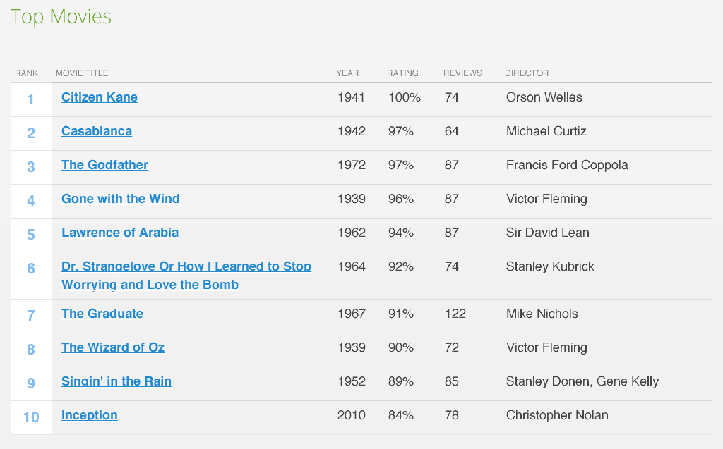
In this example from the jQuery Mobile library, we have a table containing the top movies ordered by rating.
On a wide screen, it is helpful to see the movies in a table because it makes it easy to scan each column. But it is unlikely that people are relying on the table to compare rows or columns.
There isn’t a tremendous value to be gained by comparing the director from row 1 (Orson Welles) to row 2 (Michael Curtiz). Similarly, comparing the ratings column to either of the columns next to it—year and reviews—doesn’t add much, if any, meaning to the table.
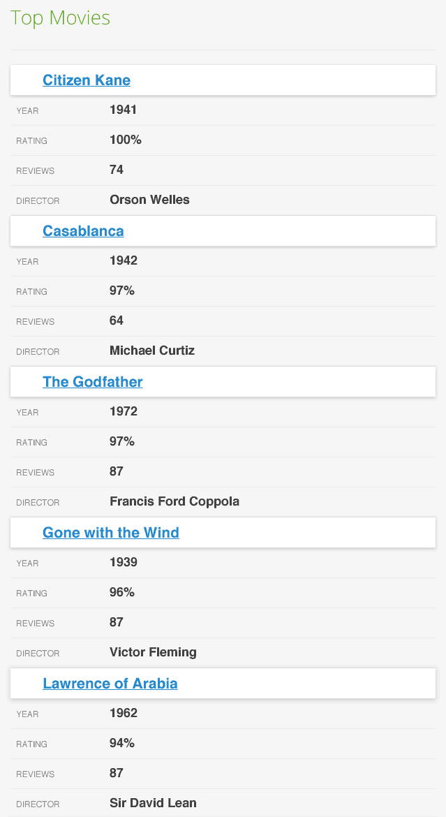
Because people do not compare rows or columns, this table is a good candidate for being transformed into a list on smaller screens:
Which is exactly what the jQuery Mobile developers do in their demo. Check it out.
Example 2: People compare rows or columns
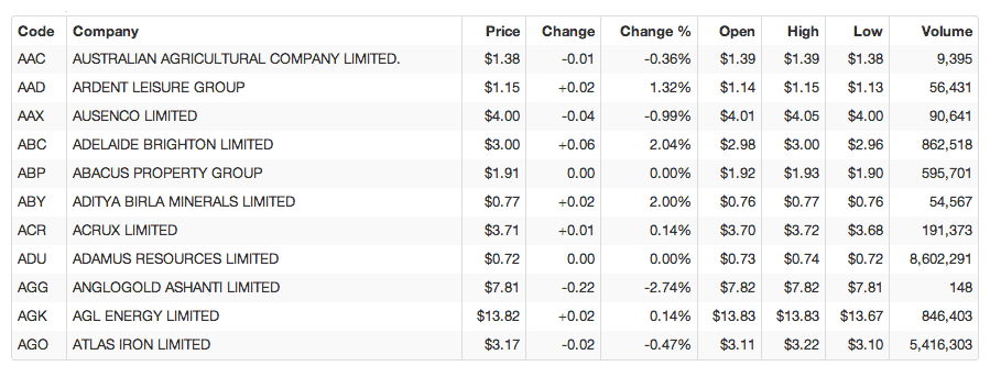
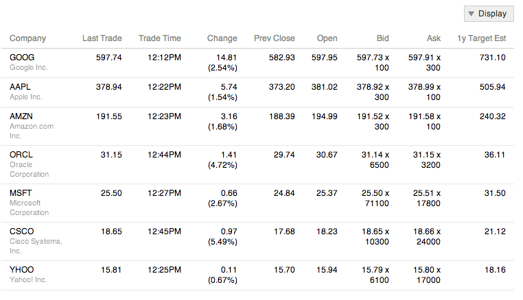
If you have a table listing a bunch of stock and their prices, like the one below from Simon Elvery, then you will probably find that people are comparing one stock to another to see if they are investing in the right places.
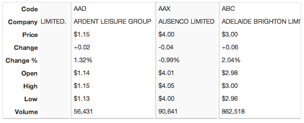
In this case, we want a solution that allows people to continue to compare rows. In the example Simon provides which is based on work by David Bushell, the table flips so that the header row is a header column and the rows are now columns that are scrollable.
Again, this is something best seen in action by going to Simon’s Flip Scroll example. This is very similar to Zurb Foundation’s responsive tables solution.
Another way to handle this need to compare is to reduce the number of columns so that the table fits as demonstrated by the Filament Group.
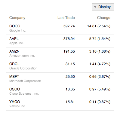
They also used a stocks table as their example, but on narrow screens, they hide columns that are deemed less important.
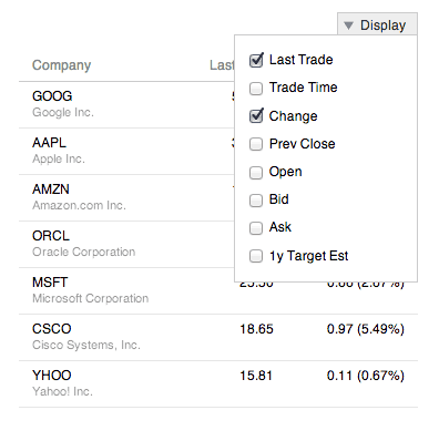
If someone needs to see a column that has been removed, they can use the pull down menu to add it into the table.
Check out the Filament Group demo and a similar demo from the jQuery Mobile showcase.
What information is essential?
If you find yourself in a situation where you want to show fewer columns on small screens, then you have to start asking yourself what information is essential. It is helpful to ask yourself these questions.
What information do people care about the most?
- Which columns are most critical to understanding what the meaning of the table is?
- Which columns are people most likely to care about?
What is necessary to be able to differentiate one piece of information from another?
If you’re looking at row after row of information, what information would allow a person to quickly distinguish between two rows? This is particularly important in scenarios where the rows are used in applications interfaces.
Say you have a table that shows information about users. Administrators can select a user and then edit that user’s account.
On wide screens, you would might include things like the user’s roles, last time they logged in, etc. But on small screens, you simply need to make sure that you’ve provided the critical information that an admin needs to be confident that they are selecting the right user.
Is it necessary for everything to be on the same screen or can you conditionally load additional detail as needed?
A lot of the more complex responsive tables implementations I’ve seen have come in situations where the developer was trying to fit every piece of content that was available on wide screens onto small screens.
In some of the more extreme examples I’ve seen, this has caused huge performance and layout problems as tables with hundreds of rows and dozens of columns were combined with fixed header rows and columns and squeezed onto a small screen.
I think the mistake a lot of people make is believing that responsive design means that they have to everything in the same document regardless of screen size.
If you were to start a mobile first design of a stock table, you might say that on small screens, you are going to show the following columns:
- Company name
- Ticker symbol
- Price
- Percent change
If the user wants more data, they select a stock to go to a detail page and view more information about the stock.
Then as the screen got bigger, you might show more columns. You might even decide that on wider screens that you will make AJAX calls to retrieve the data from the detail page you built for small screens.
This all makes sense. You’re using progressive enhancement based on screen size. No big deal.
There is a funny thing that happens when you flip it around—when you start from existing big table of data that was designed for wide screens. People no longer allow themselves the option to not have everything on the same screen.
I’ve observed on more than one occasion that designers and developers no longer feel like it is acceptable to not show all the columns or to have people go to a detail page to see more information on small screens. That doing so is not responsive design and is cheating in some way.
I think it is a mental trick that we play on ourselves depending on our starting point. If we start mobile first, we never doubt it. If we start from an existing desktop table, we unconsciously limit our options.
Here’s what matters when it comes to tables in responsive design:
- Do people understand the meaning of the table in all contexts?
- Can people get to all of the information somehow?
- Have you made sure that every URL is accessible regardless of device?
If you can answer yes to all three, then you’ve done your job.
Your content will dictate the best responsive table solution
There are a lot of different ways to handle tables in responsive designs. And I expect that we will see more alternatives and techniques as time passes.
But regardless of how many responsive tables solutions we have to choose from in the future, the way to select the right one for your project will remain the same.
Your content will dictate the best responsive table solution. You just have to ask the right questions of it.
Responsive table resources
The following is a non-comprehensive list of potential responsive tables solutions. I use them primarily as inspiration and design patterns.
- Zurb Foundation Responsive Tables
- Responsive Tables Demo by Simon Elvery
- Responsive Tables(2) by Dave Bushell
- Responsive Table by Chris Coyier
- Responsive table to list by Aaron Gustafson
- Responsive Table with Column Select by Filament Group
- jQuery Mobile Showcase
- Pie chart responsive table
- Responsive data charts
- Responsive tables design patterns maintained by Brad Frost

