Get More For Less With Variable Fonts
At 4/19/2024
I recently worked on a project where the topic of variable fonts came up when discussing typeface legibility. I had heard the term before, but I wasn’t quite sure what a variable font was. Curious, I did some digging and was excited to discover all the possibilities that variable fonts bring to the table.
What is a variable font?
Most websites use a handful of fonts that belong to the same font family. Every font is stored in a separate file and has a unique set of properties like width, weight, and style. Variable fonts store all those variations in a single font file. Unlike static fonts though, variable fonts give you access to an entire range of widths, weights, and other properties. For example, most font families include a set number of fonts with different weights available in incremental values from 100 to 900. Variable fonts offer the ability to use any weight within a specified range. So if font-weight: 470 is perfect for your site, you can use that.
Variable Fonts In Action
The demo below provides an example of the entire range of styles that are possible with a single variable font. The sliders can be used to adjust the type weight, width, and slope.
Sounds Cool, But…
If you’re like me and hadn’t heard of variable fonts before, you might wonder how useful they are. There are a couple of key reasons you might want to work with a variable font.
Performance
As you may have guessed, the ability to access an entire font family from a single file can improve performance. Variable fonts reduce the number of HTTP requests for font files and the amount of data that needs to retrieved. Even though variable font files usually have a larger file size, they’re usually smaller than multiple static font files. There are exceptions, though. If your site only uses a single font-weight or font-style you may not see the same performance gains as sites that use multiple fonts.
Responsive Design
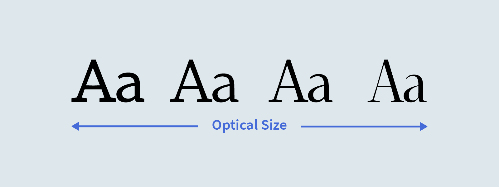
Screen size often informs typographic decisions like weight, size, etc. Variable fonts allow for greater control of these properties. Properties like x-height, descender length, and optical size could all be adjusted in relation to screen size to improve readability. The image below uses the variable font Amstelvar to show the transition from a low to high optical size. Contrast is lower at small sizes to improve legibility. At larger sizes, contrast is increased.

How do variable fonts work?
Now that you’ve seen what variable fonts can do, let’s look at how they work. Variable fonts store one outline for every character. The points that make up the outline have instructions on how they should move to create other styles. Individual styles are interpolated using these instructions. Changes are made along various axes, like a weight axis.
Axes Of Variation
Axes of variation describe what properties are variable and what the allowable range is for those properties. Variable fonts can have two types of axes: registered axes and custom axes.
Registered axes are the most common axes and are explicitly defined. There are five registered axes including weight, width, italic, slant, and optical size. Each registered axis has a corresponding four-letter tag and can be mapped to existing CSS properties.
| Registered Axes | Four-Letter Tag | Property |
|---|---|---|
| Weight | ‘wght’ | font-weight |
| Width | ‘wdth’ | font-stretch |
| Italic | ‘ital’ | font-style |
| Slant | ‘slnt’ | font-style |
| Optical Size | ‘opsz’ | font-optical-sizing |
Note, registered axes are not a required feature. The decision about which axes to include is up to the typeface designer.
In addition to registered axes, typeface designers can include custom axes. Custom axes open up a lot of creative possibilities because there are no restrictions on the scope, definition, or number of custom axes allowed. Similar to registered axes, custom axes have a corresponding four-letter tag. However, custom axis tags must be uppercase. For example, a common custom axis is grade which is usually represented with the four-letter tag GRAD.
A Closer Look At Tags
I’ve mentioned tags a few times, so you might be wondering how to use them. CSS specifications prefer that font-weight, font-stretch, font-style, and font-optical-sizing be used for controlling registered axes where possible. Custom axes can be accessed using the font-variation-settings property. In the example below, GRAD is a custom axis.
.my-style {
    font-stretch: 120%;
    font-variation-settings: 'GRAD' 120;
    font-weight: 450;
}
Code language: CSS (css)New Possibilities
Variable fonts create new possibilities for transforming typography. From practical use cases like improving readability to more creative uses like these illustrative fonts by Typearture. If you want to do your own explorations, some great places to find variable fonts are Axis-Praxis and V-fonts.
