Fixed and inflexible
At 4/19/2024
Even before smartphones came along and dashed any hope for a 960-pixel-wide web, designers and organizations have struggled with the challenge of prioritizing and composing content that scrolls. Our screens act like windows to content of variable size and scale, demanding an awful lot of abstract thinking to design for. Sometimes we’re successful, revising content, designing modern day deliverables and embracing compromise like we know in our hearts we should. Other times, we convince ourselves that we can predict this inherently unpredictable medium, making decisions that age quickly and poorly by prioritizing the window instead of the content.
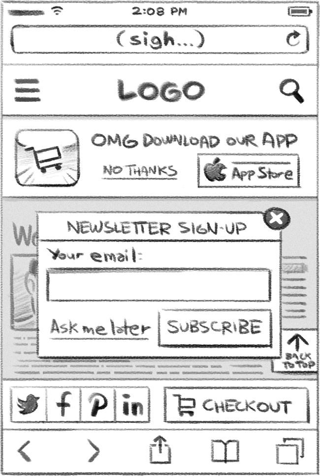
Most recently, I’ve noticed a sharp uptick in the number of requests I receive to explore fixed-position (aka “sticky”) interface elements. Fixed elements are positioned relative to the viewport instead of the page, allowing them to maintain position even as the document scrolls. Some of the most popular sites on the web employ “sticky” menus, and with good reason… when applied thoughtfully, they can yield substantial usability improvements.
But when fixed positioning is used without care, restraint or precision, it can have disastrous consequences. Here are some of the reasons why.
We can’t predict how much space we have.
Our industry has a nasty habit of quietly embracing display resolution “standards” that are mostly fantasy… design decisions are a lot easier if you assume all devices are 320 pixels wide by 480 pixels tall (and users never turn them sideways). The inconvenient truth is that display resolutions vary wildly. Each additional “sticky” element increases the risk of obscuring the page content mostly (or entirely) for some users… in which case the page might as well not exist at all.
We can’t get those pixels back.
Fixed elements aren’t just “prominent,” they photobomb the interface, robbing focus and attention from what really matters — the content! Before you make something “sticky,” consider reevaluating the element’s importance relative to the entire page (instead of on its own merits).
It makes scrolling tougher.
As evidenced by the years-long debate over “The Fold,” the fear that users won’t know (or lack willingness) to scroll persists to this day. When that fear is real, then fixed positioning is a godsend, ensuring the visibility of content regardless of scroll position.
But those fears don’t mesh with reality very well.
Today’s users are so familiar with scrolling that most mobile browsers will hide the scrollbar entirely. “Sticky” elements complicate matters by reducing or obscuring the scrollable area, forcing the user to swipe more carefully to avoid accidental actions.
Ironically, our desire to alleviate the supposed “difficulty” of scrolling may make scrolling that much more difficult!
It can slow everything down.
Users care about speed. But speed isn’t all about navigation… there’s also the overall speed of the experience. Fixed positioning can result in strange browser-specific quirks or even costly repaints, potentially counteracting any efficiency you might have gained.
It may not actually work.
Mobile websites share a lot of their design vocabulary with native mobile apps, where fixed headers, menus and tab bars are commonplace. This makes it easy to forget that fixed positioning as we know it is relatively new to the web, and often unreliable.
“Sticky” headers, footers and navigation flourished in the 1990s, often implemented using frames. When frames fell out of fashion in the early 2000s, most browsers did not support fixed positioning using CSS. In the absence of frames, position: fixed or consistent, intuitive JavaScript, fixed positioning became just another discarded Web 1.0 trend… at least until CSS support arrived in IE7.
But smartphone browsers have historically not supported position: fixed as predictably as their desktop counterparts. It was entirely absent from mobile Safari prior to iOS5, and largely unusable in Android browsers prior to Honeycomb. To this day, behavior can be inconsistent across platforms. To quote Brad Frost in his excellent post on Fixed Positioning in Mobile Browsers, “‘support’ isn’t exactly binary.”
Since you can’t rely on support for fixed positioning, you’ll need to make sure your experience works without it anyway. Which begs the question…
position: fixed at all?
Why position: fixed at all?
I believe there are plenty of interface elements that benefit from fixed positioning, provided they follow a few best practices:
- The “sticky” element is clearly more important than everything else on the page.
- The footprint of the element is modest enough that it does not obscure too much of the page content (even in landscape).
- Any efficiency gained from the element’s consistent availability is significantly greater than any lost as a result of the element’s inclusion (due to performance, obscuring of page content, etc.).
- There should only be one “global” (navigation, tab bar, etc.) and one “temporary” (modal, dialog, etc.) fixed-position element on-screen at any one time.
- Fixed positioning should always be an enhancement. Your interfaces should never rely on it.
If any of these considerations completely upend your design aspirations, you may want to rethink your user experience with less rigidity. As John Allsopp so aptly put it fourteen years ago, “The journey begins by letting go of control, and becoming flexible.”


