Designing Button States
At 4/19/2024
Buttons are a staple of any design system. The best ones are simple, versatile, maybe even a little fun. But there’s a lot of hidden complexity in these jolly, candylike controls and toggles… complexity that’s easy to overlook when we focus on the same old default and hover states in our designs.

In truth, mouse effects are probably the least important state to design for. By accounting for more functional states early, you can lower the need for costly redesigns as your pattern library matures.
Here are the fundamental states you should address early on, in approximate order of importance.
1. Default
Perhaps unsurprisingly, the standard button appearance is really important. Make it too prominent or too reserved and you’ll see it become underused across your projects without modifier classes or alternative styles.

It’s also important to design buttons in some sort of context. One common mistake is to choose a button style that isn’t differentiated enough from input fields, which can make forms confusing to navigate.

It’s also important to choose colors with adequate contrast for most users. I use the Contrast app to test my designs for WCAG 2.0 compliance:

2. Focus
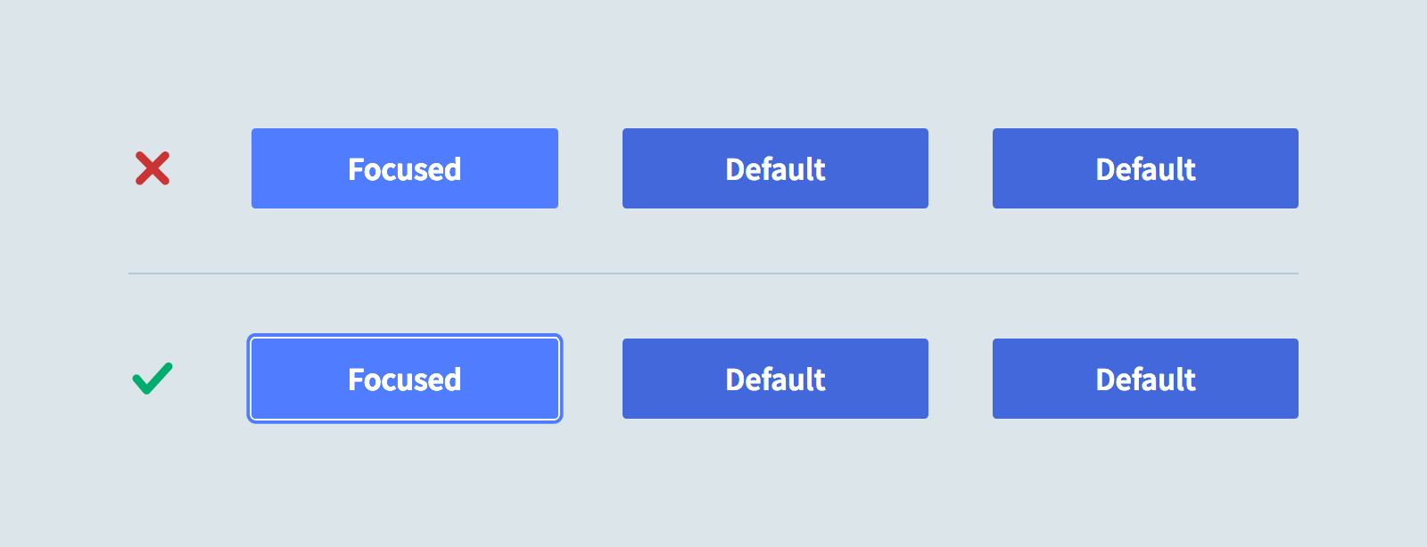
The most important state to account for is :focus. Without it, navigation via keyboards or other directional input devices is virtually impossible. The good news is that browsers already include a solution by default, typically a dotted outline or blue glow:

These outlines can sometimes feel inconsistent with a project’s visual styles, which is why they’re frequently disabled… leaving many users in the dark. So let’s all raise a hand and repeat after me:
“I do solemnly swear never to disable browser focus styles without including a thoughtfully designed replacement.”
Good job! With that out of the way, here’s what to keep in mind when designing a custom focus style:
- In a group of buttons, the focused one should be easy to spot.
- It should not rely entirely on color and value changes, which can be difficult for some users to identify.
- Ideally, it should be flexible enough to work across many button styles without frequent overrides.

3. Expanded/Toggled/Selected
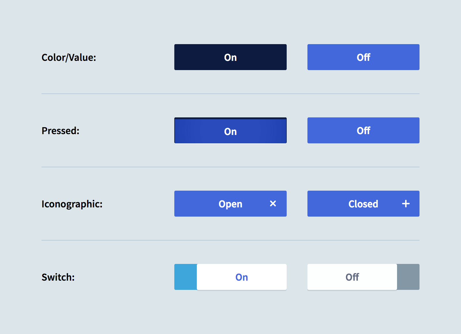
While it may seem a far-off possibility in the early days of a design system, it’s very likely that at some point you’ll need buttons that act as toggles: Opening and closing menus, toggling a like/favorite/bookmark, switching tabs, etc. Considering this possibility early helps avoid potential conflicts with other button states down the line.
An expanded button design can vary a lot per project. You may even need more than one. The important considerations are that the “on” and “off” states are distinguishable from one another, and that it cooperate well with your focus styles.

4. Disabled
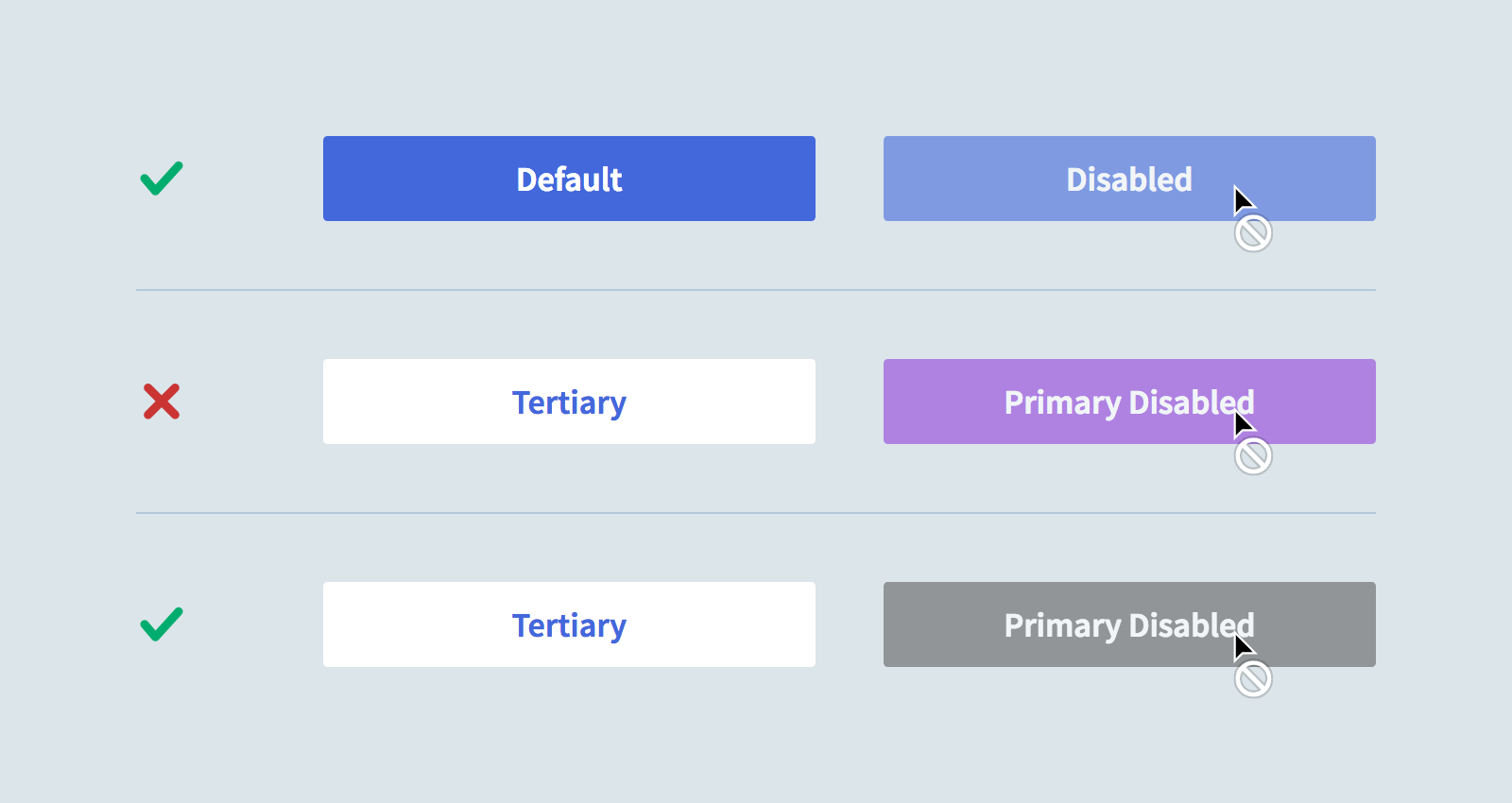
Like focus and expanded states, disabled buttons should be easy to identify. Unlike those states, it should not stand out from the crowd. The disabled state should feel muted, inert, dull.
One of the most popular methods of styling disabled buttons is to lower their opacity. This works well for buttons with the same default style, but less so when a disabled button has more saturated colors than its neighbor. A combination of opacity and desaturation can do the trick:

5. Hover and Active
Okay, I know it’s a drag waiting this long to design these states. But there are at least two really solid arguments for holding off:
- These states will only apply to some users and input types. Not everyone uses a mouse, not everyone uses their fingers.
- It’s way, way more fun to design these states with awareness of everything else.
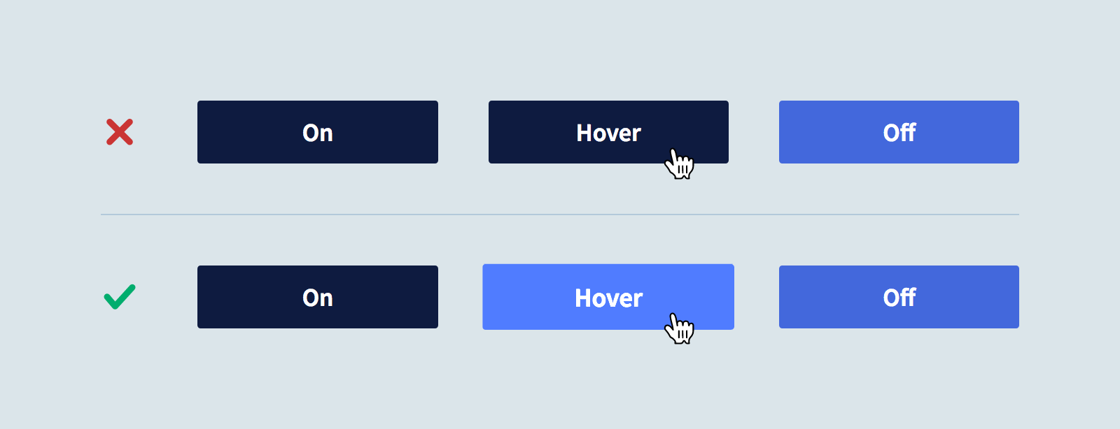
Having waited, we now know which effects would overlap with other states:

We also know enough to gracefully transition between and reinforce these states via color, scale and animation:

Tip of the Iceberg…
This is by no means an exhaustive list of considerations for designing resilient, extensible button patterns in a design system (for that, I recommend reading Nathan Curtis’s Buttons in Design Systems). It’s merely a call for designers to re-prioritize the button states they explore early on.
Next time you pop open your editor or design app of choice, consider holding off on that hover state till you’ve defined more essential states like focus, expanded and disabled. It might make all your button interactions that much more useful and delightful.
