Component-Specific Design Tokens
At 4/19/2024

In a recent project, I helped implement design tokens in an established design system. One of the more challenging parts of this work was updating the components to use design tokens. I learned a couple of things that might help speed up the process for others. Before we talk about using design tokens with components, let’s review what design tokens are.
What are Design Tokens?
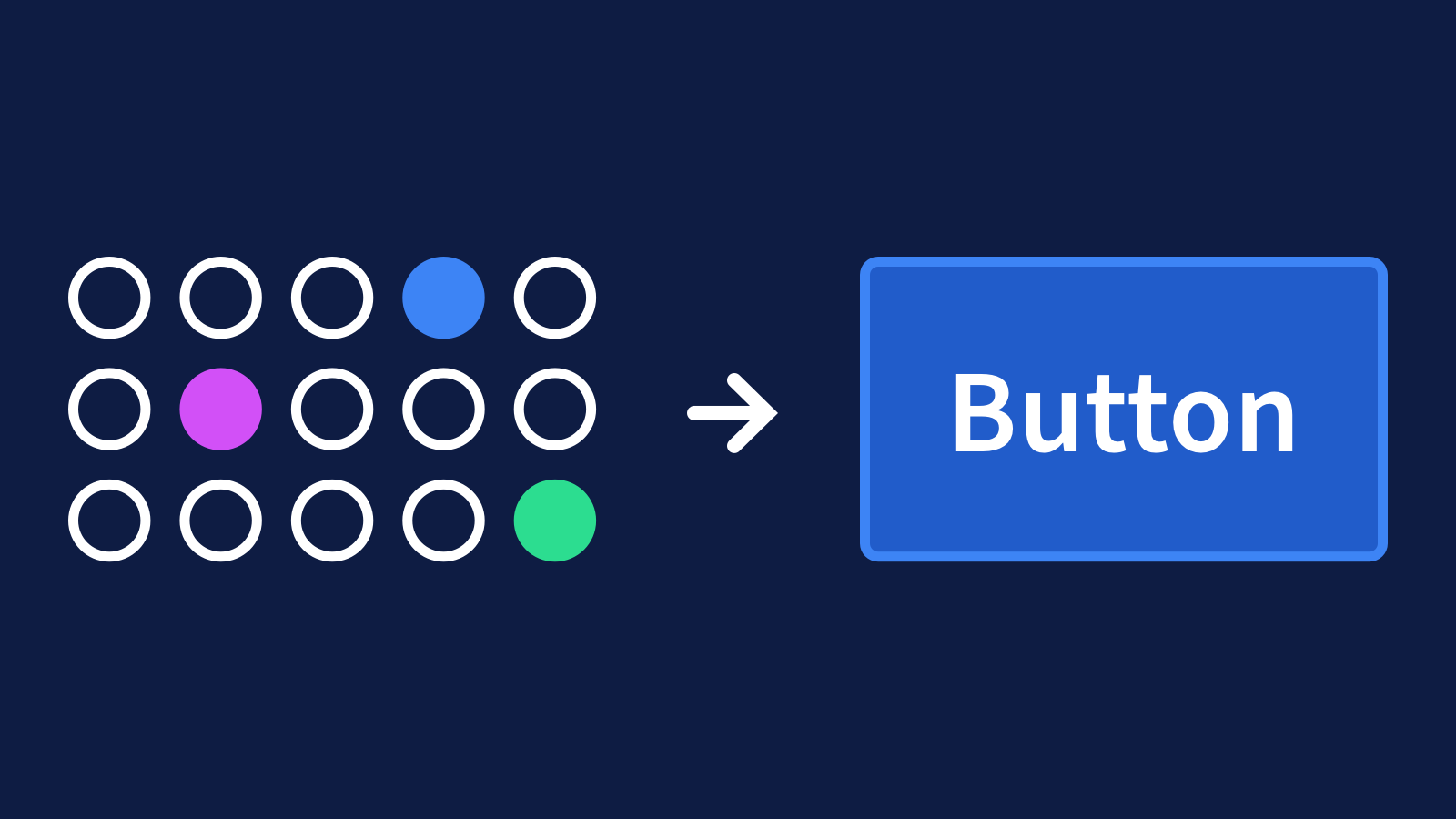
Design tokens represent all the individual attributes of a design system like color, typography, spacing, animation, breakpoints, etc. Each token represents a single design decision, like the value of a color or font size. They are used in place of hard-coded values to make systems scalable and consistent.
Organization
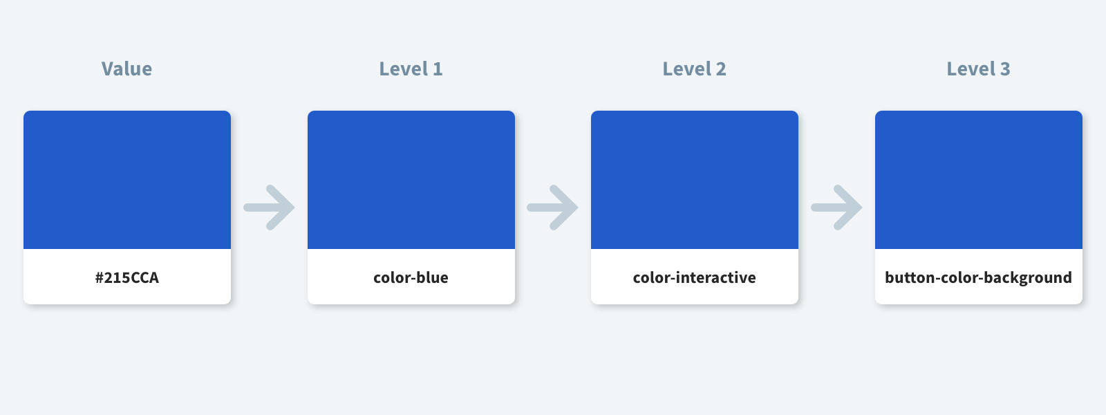
I’ve found it’s helpful to have multiple levels of design tokens. It gives you the option to use design tokens broadly or in specific contexts. Here’s one way we can break design tokens into different levels:

Level 1: Global Tokens
At this level, tokens represent core design decisions like color, typography, sizing, and animation. They aren’t tied to a specific use case. They can be used globally or consumed by other tokens.
Level 2: Application-Specific
Application-specific tokens help communicate the intended use of the token. For example, color-blue doesn’t say much about how or when the color should be used. But color-interactive makes sense to use for links or a CTA.
Level 3: Component-Specific
We can take this idea one step further with component-specific tokens.
Component-specific tokens represent the properties associated with a component.
A tiered system like this might not be necessary for every project, however using component-specific tokens has some benefits.
You can use component-specific tokens to support multiple themes in one design system. In design systems with multiple themes, each theme defines the value of its design tokens. Meaning component-specific tokens can have different values in each theme. This is handy if your design system has light and dark modes, different brands, or different products.
Component-specific tokens are also self-contained. If you change the value of the token, it will not affect anything outside of the component.
Component-specific tokens also make the function of the token clear. Sometimes the name of a token may not make sense in the context it’s being used.
It can be tricky to figure out when you need to add component-level design tokens, though. Here’s what I found works for me.
Adding Component-Specific Tokens
You’ll need to grab the CSS (or the specs where design decisions are stored) for the component. Here’s some CSS for a button component we can use as an example.
.button--primary {
  background-color: #3366cc;
  border: 2px solid #1b66b1;
  border-radius: 5px;
  box-sizing: border-box;
  color: #fff;
  cursor: pointer;
  display: inline-block;
  font: inherit;
  font-weight: 600;
  margin: 0;
  padding: 10px 20px;
  text-align: center;
  transition: background-color 0.2 ease-in;
}
Code language: CSS (css)
Pick a starting point and be systematic. I like to start from the beginning of the CSS file and work my way through one class at a time.
Look at each property in a class to determine if it needs a design token. There are two main criteria to consider when deciding whether or not to add a design token:
- Could the value of this property change? For example, design decisions like
color,background-color, andpaddingmay evolve over time. Other properties that have more to do with the structure of the component, such asdisplayorz-index, are less likely to change. - Will the value of this property change across themes? Some differences, like
background-color, are easy to spot by looking at the component. Other properties, like transitions, are harder to see. I find it helpful to have the CSS (or design specs) of a different theme for reference. This removes any guesswork. You can compare the value of each property to see if it changes across themes.
Looking at our button example we can go line by line to determine if a property value meets the criteria for adding a component-specific design token. The first property, background-color, could change over time and is most likely different between themes. This is a good candidate for a design token.
Once you’ve determined a token is needed, add it wherever your project is storing tokens. This example uses a JSON file that would work well with Style Dictionary, but the basic principles are the same no matter which tool you use.
{
  "button": {
    "color": {
      "background": {
        "primary": "#3366cc"
      }
    }
  }
}
Code language: JSON / JSON with Comments (json)
Once the token has been added, update the CSS file with the token. In this example, the token has been transformed to a custom property, but it could be translated to something else like a Sass or Less variable.
.button {
  background-color: var(--button-color-background-primary);
}
Code language: CSS (css)
As we continue working our way down, some properties like box-sizing, cursor, display, and text-align seem like they are less likely to change over time or between themes. Because they don’t meet the criteria, it’s not necessary to replace the hardcoded value with a token.
Once you’ve worked through each line of CSS, pat yourself on the back because your component is now using design tokens! With design tokens in place, it should be easier to update and maintain consistent visual styles across platforms, as well as support multiple themes.
