Case Study: Our SVG Icon Process
At 4/19/2024
Update (July 2019): Our process has changed quite a bit since this article was written. Check out our latest update!
When I wrote about why you shouldn’t use icon fonts in your next web project, I had no idea it would spark so much heated debate and intense discussion. One recurring question stood out to me: How might one actually implement an SVG icon system?
It’s a surprisingly difficult question to answer. Should you use <img>, <svg>, <object> or pure CSS? Will you combine your icons into a single sprite or keep them separate? If you do combine them, do you use an old-school technique or embrace SVG’s built-in features? Can JavaScript factor in somehow?
Though this variety of options might feel overwhelming, it’s ultimately a good thing. SVG’s versatility empowers us to craft the most appropriate solution for our audience and use-case.
So as much as I’d like to, I can’t say exactly how you should implement SVG icons in your next project. There’s no substitution for research and trying stuff out when it comes to finding the best fit for your project.
Instead, I’m going to show how we tend to assemble and implement SVG icons, and why we do it that way.
What We Do
The icon process we’ve adopted here at Cloud Four is a byproduct of the types of projects we take on, which tend to be large responsive redesigns or brand-new responsive interfaces. Our most common deliverables are in-browser mockups and pattern libraries. We often work with existing in-house teams, designing or extending icon systems based on their brand guidelines.
The front-end problems we solve tend to be those that are too complex or idiosyncratic to tackle with a framework or a simple content reflow. Our most common use of icons is to reinforce the meaning or relative importance of interface controls (a plus next to the word “Add,” a checkmark next to the word “Okay,” etc.).
Our Requirements
With this context in mind, we can assemble a list of requirements:
- Accessibility: Because our icons represent or reinforce content, they should exist in markup.
- Design: Our icons will most often coexist with text. They should inherit the text color and flow with the text by default.
- Performance: Icons should be consolidated into a single, external sprite to avoid multiple requests and maximize caching.
- Workflow: Whatever icon prep we can automate should be baked into our existing development tools (Node.js and Gulp).
- Browsers: Our projects tend to be optimized for IE9+, Android 4.3+ and the usual array of less finicky modern browsers.
With requirements in hand, it’s time to build an SVG icon system!
1. Exporting Icons
Though our team digs Sketch for UI explorations, we still feel like Illustrator is a bit more intuitive for the design of icons and other illustrative elements.
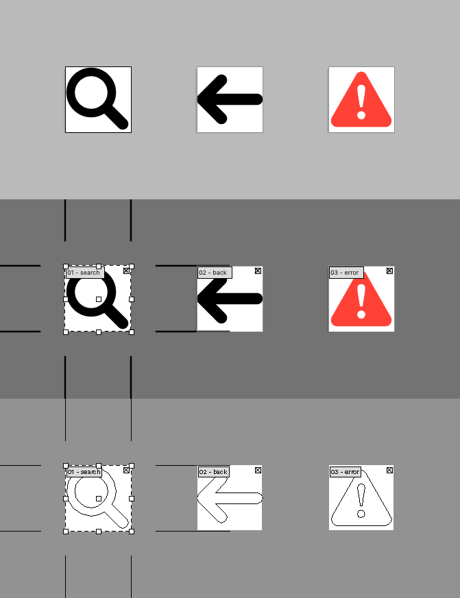
We maintain a master icons.ai file in a shared spot (usually Dropbox), with each icon in the library residing in its own named artboard. We can see every icon in the context of its siblings, make any final tweaks for consistency, and simplify or combine any overlapping or unnecessary paths.

During this process, we purposely avoid preparing different rotations of the same icon. Traditionally, icon sets have exported separate assets for “left arrow,” “right arrow,” etc., but with SVG this repetition is redundant and unnecessary. Later on, we’ll walk through how to create simple rotational variations of the same icon.
Once everything’s looking good and feeling clean, we use Illustrator CC’s recently-improved exporting to generate SVGs from our artboards. After removing anything Illustrator over-enthusiastically prepended to our filenames, we’re ready to smoosh all of our icons into a single sprite.
2. Creating Our Sprite
As mentioned earlier, our team likes using Gulp for our local environment. If you’ve never used Gulp before, here’s a great article covering the basics. We’re going to write a Gulp task called icons this will compile a folder of separate, unoptimized SVG icons into a single, optimized sprite we can reference from our HTML.
Of the handful of plugins we’ve tried for accomplishing this sort of thing, our favorite is currently gulp-svg-sprite. It boasts a wealth of output modes and configuration options, making it the perfect choice for control freaks like yours truly.
For our icons task, we’ll be using the plugin’s symbol “mode.” This will transform each of our SVG files into a <symbol> element, which we’ll be able to reference by ID later.
Here’s what our SVG task might look like:
var gulp = require('gulp');
var svgSprite = require('gulp-svg-sprite');

var svgSpriteConfig = {
  mode: {
    symbol: {
      dest: '',
      sprite: 'icons.svg'
    }
  }
};

gulp.task('icons', function () {
  return gulp.src('./src/icons/**/*.svg')
    .pipe(svgSprite(svgSpriteConfig))
    .pipe(gulp.dest('dist'));
});Code language: JavaScript (javascript)
This task will:
- Find every SVG file in the
src/iconsdirectory. - Pass those files to the
gulp-svg-spriteplugin, which combines them into a singleicons.svgfile using thesymboloutput mode. - Output the result to the
distdirectory.
Now if we run gulp icons, we should find a shiny new icons.svg file in our dist directory, ready to be referenced from our markup.
3. Including Icons in Our Markup
Now that we have our SVG sprite, we can reference it from our markup using <svg> and the <use> element:
<svg>
  <use xlink:href="icons.svg#back"/>
</svg>Code language: HTML, XML (xml)
This markup tells the browser “use the symbol with ID back from the file icons.svg.” This means our external file is nice and cacheable, and we can reference the same icon asset multiple times from the same file! Hooray!
Except, it looks like garbage:

We haven’t told the browser how we want our icons to be sized, filled or aligned based on their surroundings. To do that, we need some CSS.
4. Styling Icons
We don’t want to style every svg because SVG can be used for a lot more than icons. Instead, we’re going to create a class. Our team likes using SUIT CSS naming conventions, so we’ll name our class Icon:
.Icon {
  /* Flow with text content */
  display: inline-block;
  /* Inherit the parent text color */
  fill: currentColor;
  /* Use the parent font-size for width and height */
  height: 1em;
  width: 1em;
  /* Vertically align icon with adjacent text */
  vertical-align: middle;
  /* Align more nicely with capital letters */
  position: relative;
  top: -0.0625em;
}Code language: CSS (css)
(Props to Chris Coyier and Jonathan Snook!)
Here’s the result after adding class="Icon" to our SVG element:

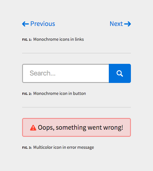
Success! Our icons are successfully inheriting their size and color, and aligning nicely with adjacent type.
This accomplishes most of what we set out to do, but we haven’t taken advantage of what makes SVG special just yet. Let’s fix that.
5. Adding DRY Variations
Back when we were exporting icons, we only exported a single arrow asset (back.svg), the contents of which looked something like this:
<svg xmlns="http://www.w3.org/2000/svg" viewBox="0 0 24 24">
  <path d="M22,10H6.83l3.59-3.59A2,2,0,0,0,7.59,3.59l-7,7a2,2,0,0,0,0,2.83l7,7a2,2,0,0,0,2.83-2.83L6.83,14H22A2,2,0,0,0,22,10Z"/>
</svg>Code language: HTML, XML (xml)
Let’s pop open our favorite code editor, and create a new forward.svg file to compliment it:
<svg xmlns="http://www.w3.org/2000/svg"
  xmlns:xlink="http://www.w3.org/1999/xlink"
  viewBox="0 0 24 24">
  <use xlink:href="#back" transform="rotate(180 12 12)"/>
</svg>Code language: HTML, XML (xml)
Here’s what’s going on:
- Our
<svg>element is identical toback.svg, except we’ve added anxmlns:xlinkattribute. This helps avoid errors during optimization by letting the plugin know that this SVG will reference other elements. - Instead of including the forward icon’s path data, we reference our existing
#backicon from a<use>element (similar to how we reference icons from our markup). - The
transformattribute rotates the icon180degrees from the center of ourviewBox.
If we recompile our sprite, we should now be able to reference both icons from our markup:

Any changes made to back.svg will cascade to forward.svg (or any future variations). Plus, we save a small amount of file-size in the compiled sprite. Win/win!
6. Enforcing Mandatory Colors
Sometimes there are icons that really shouldn’t inherit everything about the parent. A common concern we hear from design teams is that the meaning of certain icons (in particular those representing “error” or “warning”) can be diluted over time if they are applied inconsistently.
In these cases, it’s helpful to remember that SVG elements are subject to the same style cascade as everything else. By specifying mandatory colors via attributes on the elements themselves (fill, style, etc.), we can overrule some or all color inheritance.
As an example, this error.svg file has fill attributes on the elements themselves:
<svg xmlns="http://www.w3.org/2000/svg" viewBox="0 0 24 24">
  <path fill="#ff4136" d="M13.74,3l9,15.7A2.21,2.21,0,0,1,20.9,22H3.1a2.21,2.21,0,0,1-1.8-3.34l9-15.7A2,2,0,0,1,13.74,3Z"/>
  <path fill="#fff" d="M10.59,17.82a1.41,1.41,0,1,1,1.4,1.4A1.42,1.42,0,0,1,10.59,17.82Zm2.77-9.63a32.3,32.3,0,0,1-.61,4.5l-0.34,2.11H11.6l-0.34-2.11a32.77,32.77,0,0,1-.61-4.5A1.24,1.24,0,0,1,12,6.78,1.24,1.24,0,0,1,13.36,8.18Z"/>
</svg>Code language: HTML, XML (xml)
Even with our .Icon class applied, these colors will not be overruled:
![]()
7. Improving Accessibility
Arguably the best reason to adopt SVG is to take advantage of its accessibility features. Thanks to Léonie Watson’s Tips for Creating Accessible SVG, we know to add the following elements and attributes to our icons:
<svg
  xmlns="http://www.w3.org/2000/svg"
  viewBox="0 0 24 24"
  aria-labelledby="title desc">
  <title id="title">Back</title>
  <desc id="desc">A leftward arrow</desc>
  <path d="M22,10H6.83l3.59-3.59A2,2,0,0,0,7.59,3.59l-7,7a2,2,0,0,0,0,2.83l7,7a2,2,0,0,0,2.83-2.83L6.83,14H22A2,2,0,0,0,22,10Z"/>
</svg>Code language: HTML, XML (xml)
This insures that our icons have human readable fallbacks for blind and partially sighted people in a variety of user agents.
But there’s a problem with this approach. IDs must be unique, and we’ll be combining multiple files into a single SVG document. Our accessibility efforts will be thwarted if two <title> or <desc> elements attempt to use the same ID within the same document.
We could just be really diligent about choosing unique IDs, but that’s kind of a pain. If only we could manage these titles and descriptions in a central location, relying on our Gulp task to assign unique identifiers…
Luckily, we can! All we need to do is provide all our titles and descriptions in a separate YAML file:
back:
  title: Back
  description: A leftward arrow

error:
  title: Error
  description: A red sign with a white exclamation mark

forward:
  title: Forward
  description: A rightward arrow

search:
  title: Search
  description: A magnifying glassCode language: YAML (yaml)
Then update the Gulp task with the location of that file:
var svgSpriteConfig = {
  mode: { /* ... */ },
  shape: {
    // Titles and descriptions
    meta: './src/icons/icons.yaml'
  }
};Code language: JavaScript (javascript)
When we run gulp icons again, gulp-svg-sprite will add <title> and <desc> elements with unique, namespaced IDs and update the aria-labelledby attribute accordingly.
(It’s important to note that while we’ve specified <title> and <desc> elements within our sprite, you should still take care to use accessibility attributes in the page itself when the icon’s meaning is not re-enforced by its surrounding content.)
8. Supporting More Browsers
Time to address the elephant in the room…
Our icon sprite is a separate file, which is great for caching. But referencing symbols in an external file doesn’t work in Internet Explorer (though it does in Edge).
To address that, we’re going to use a polyfill called svgxuse. The script works by detecting failed external references, loading the referenced file via AJAX, injecting the sprite into the page itself, and updating the xlink:href attributes to point to the in-page resource. We like svgxuse because it minimizes the duplicated path data while retaining the ability for icons to reference each other.
The polyfill will work as-is, but we should make a couple of changes one small change to our task config to avoid any collisions with in-page content:
var config = {
  mode: { /* ... */ },
  shape: {
    // Titles and descriptions
    meta: SRC + '/icons/icons.yaml',
    // Add suffix to IDs
    id: {
      generator: '%s-icon'
    }
  }
};Code language: JavaScript (javascript)
Now we won’t have to worry about the SVG sprite being visible in Internet Explorer, and the IDs for our icons are far less susceptible to collisions once they coexist in the same document. Once we update our icon references to include the -icon suffix, we should have our target browsers covered:
Update: An earlier version of this post included specific configuration options for hiding the injected SVG sprite, but svgxuse handles that automatically now. Open source is awesome!
Putting It All Together
We made it! Here’s what we accomplished:
- Our Gulp task will compile a folder of icons into a single, cacheable SVG sprite.
- Individual icons can be referenced one or more times from anywhere in our HTML document.
- By default, icons will base their position, size and color on their parent elements and surrounding text.
- Icons may defy the default styles where appropriate.
- To avoid repetition, some icons can be simple variations of others.
- We can specify conflict-free accessibility details within
icons.yaml. - When external references fail, the asset will be injected into the page itself.
You can see a live demo of the end result or browse the code.
Before we pat ourselves on the back too vigorously, it’s important to remember that that there is no one, true SVG icon process. Your ideal setup might involve the picture element, grunt-svgstore, SVGInjector or even an existing library. It can and should change based on the needs of your project. We modify ours all the time.
So consider this just one potential starting point for your own SVG icon system. I hope you’ll share what you come up with!


