Breakpoints: Don’t Box Me In
At 4/19/2024
Big responsive projects are complicated. We’re expected to design fluid atoms and molecules that fit together to form larger interfaces. But those smaller components need to work in harmony, adapting and shifting seamlessly in concert.
And our tools work against this end goal.
Although design software is improving (especially when it comes to pattern-based design), the need to output static rectangles encourages designers to focus on a handful of “standard” sizes.

On the development side, media queries don’t allow individual elements to adapt to anything but the browser as a whole. In the absence of something like element queries, we have to work extra hard to keep all our patterns from stepping on each other’s toes.

For these reasons, it makes sense for most projects above a certain size to standardize breakpoints… defining the most common dimensions at which global design elements will shift or change.

I like this practice a lot. It promotes consistency, streamlines maintenance and makes CSS easier to read.
But it can also promote some bad habits. Here are a few to watch out for.
Breakpoint Dogma
Standard breakpoints should be regarded as suggestions more than rules. Without a crystal ball, it’s almost impossible to predict exactly which breakpoints your content will need in advance. New elements can (and should!) break the mold.
Yet I continue to hear from designers and developers who adhere to breakpoints they know aren’t working, accepting awkwardness in their layouts as a rigid technical requirement. Push back!
Device Assumptions
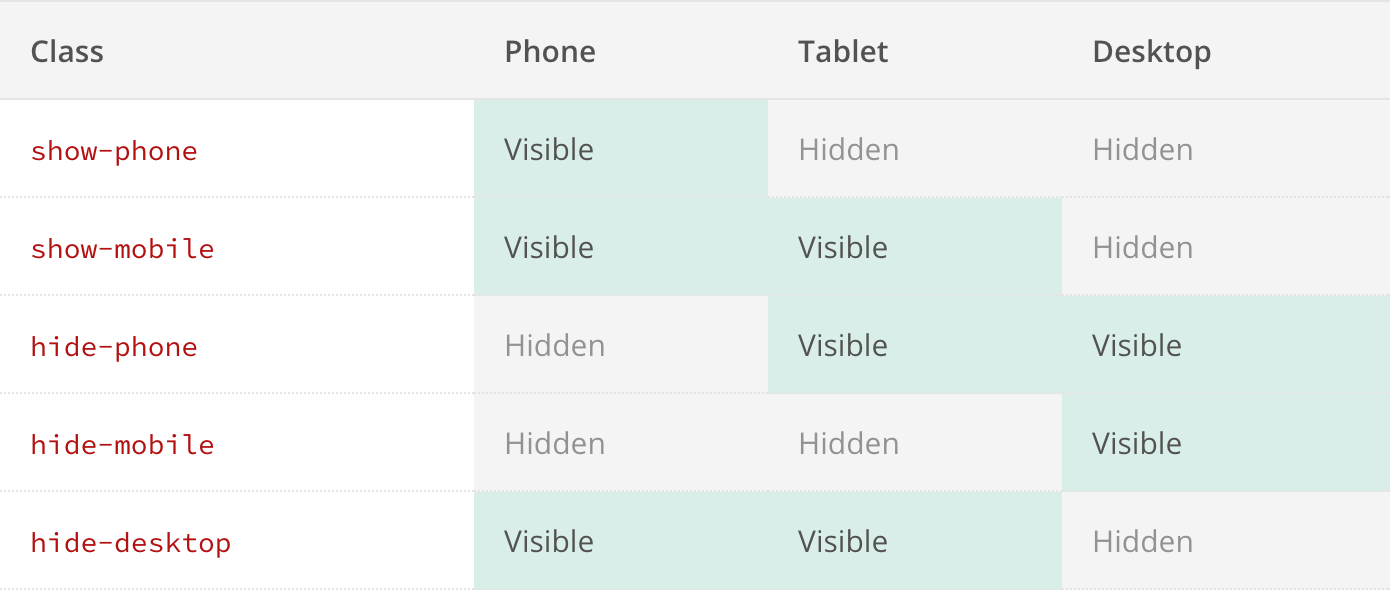
It can be tempting when deciding on standard breakpoints to assign them device categories like “phone,” “tablet” and “desktop.”

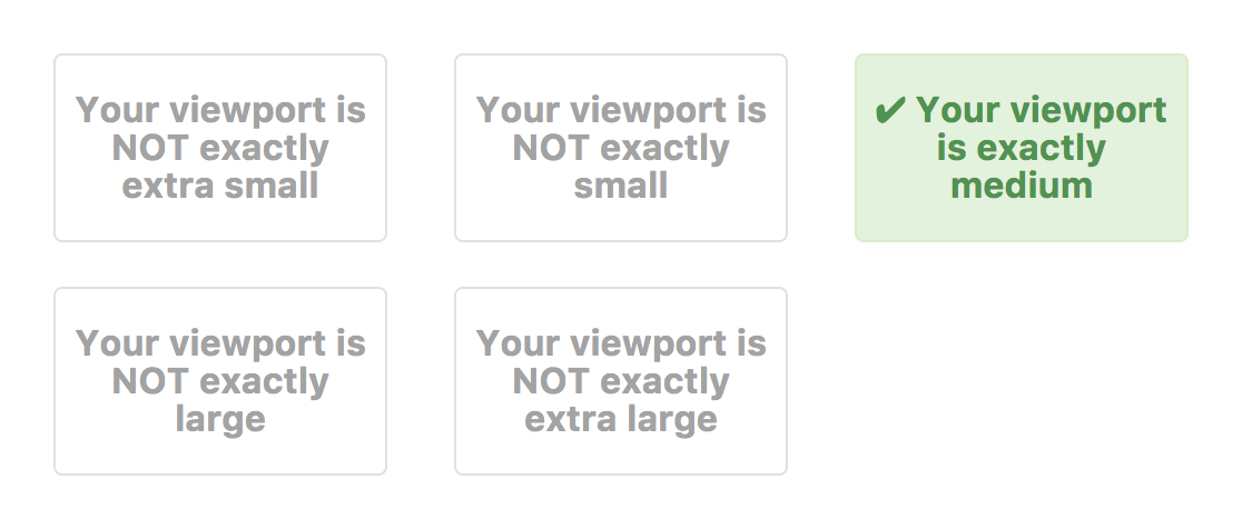
While that may seem like helpful nomenclature that paints a clearer picture than “small,” “medium” and “large,” it reenforces disproven assumptions about where device categories begin and end. Even more worrisome is how frequently I see organizations attribute more than size to these descriptors, reducing touch target sizes or relying on hover states for their “desktop” breakpoint.
Meaningless Mockups
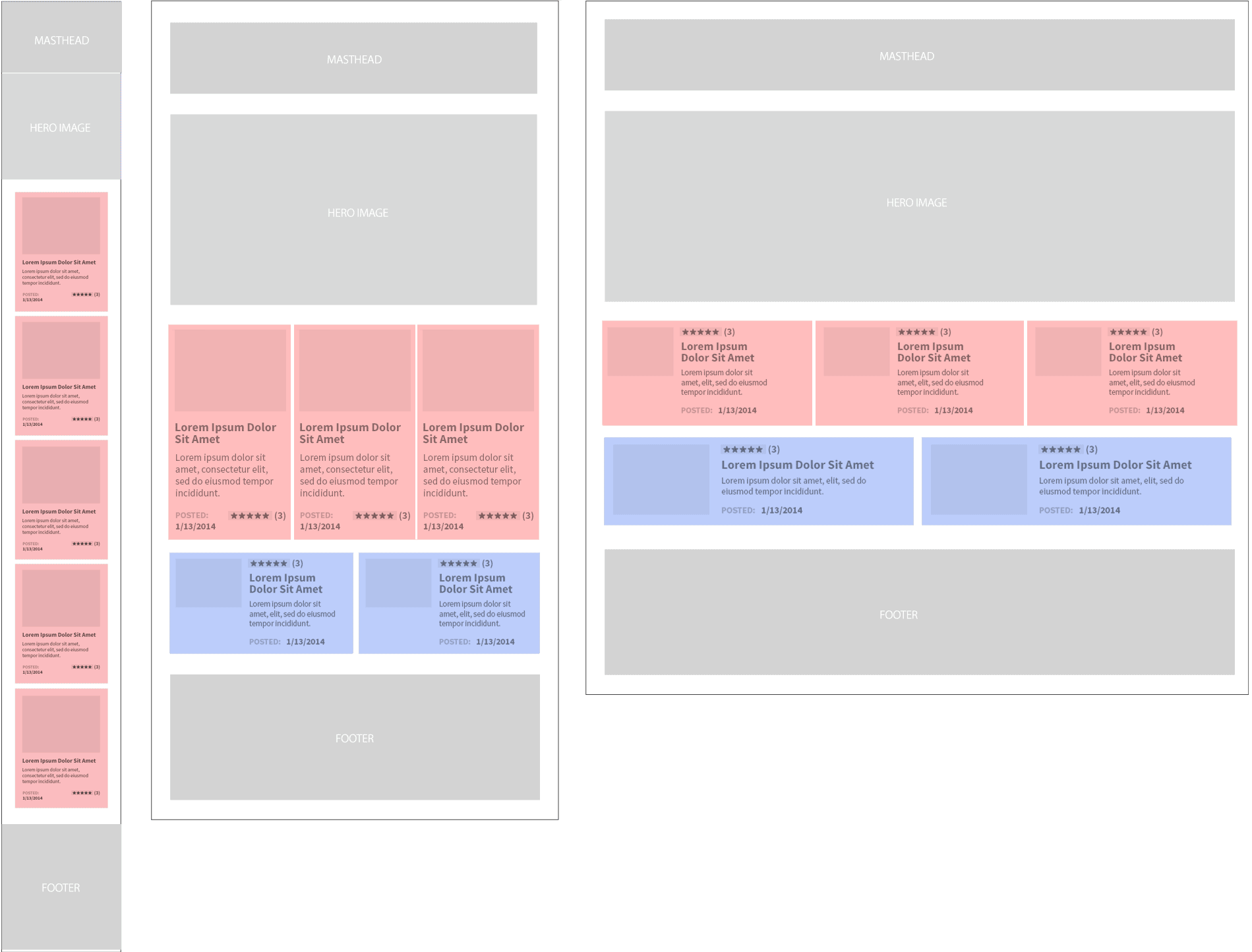
When standard breakpoints are agreed upon, many teams create templates with corresponding artboards to help streamline visual design. But this may inadvertently imply that every breakpoint requires a unique mockup, which isn’t always the case.
If you know your design won’t change substantially between narrow and wide viewports, why waste time generating (or worse, maintaining) those extra mockups?
min-width
There’s More to Life Than min-width
Designers fought long and hard against the myth that people don’t scroll, which won us the privilege of focusing largely on the horizontal axis for design elements while reserving the vertical axis for our tube of content. It makes sense, then, that most standard breakpoints cover viewport widths first and foremost.

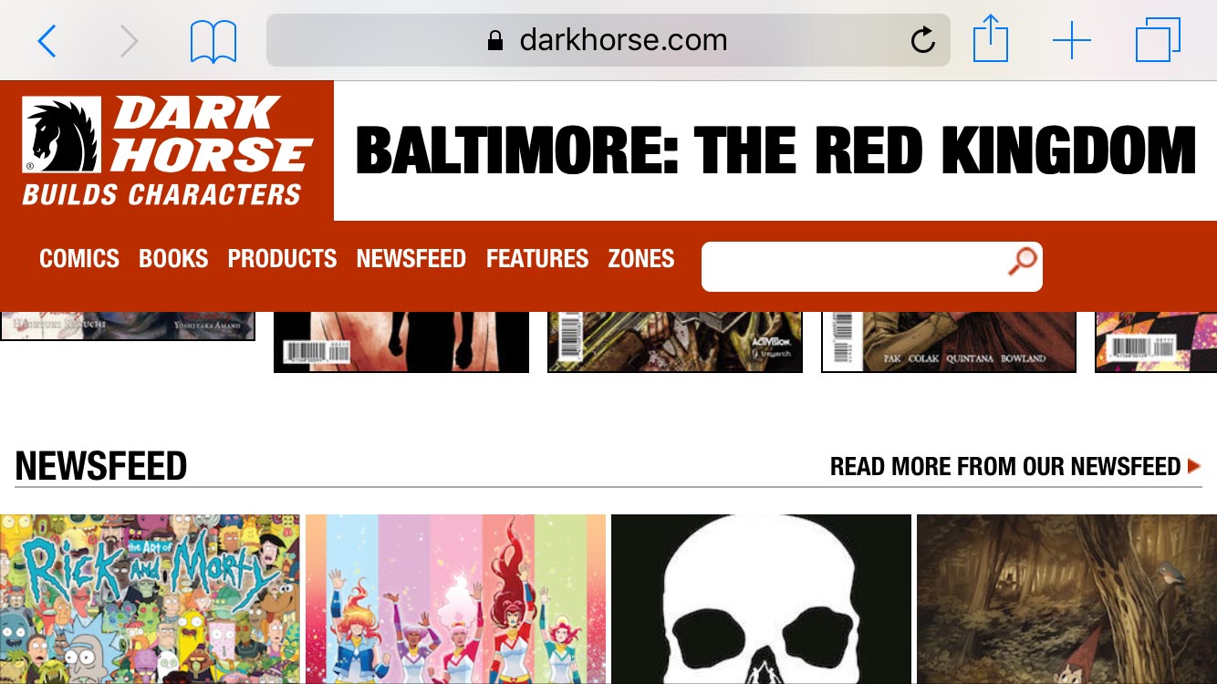
But this preoccupation with the horizontal means we’re constantly shipping comically tall websites with little responsiveness when it comes to height. It’s not as if min- and max-height are poorly supported… we’re just failing to consider them (or any others), and their omission from our design systems is one likely culprit.
Thinking Between the Breakpoints
The very best responsive designs are those that succeed in unanticipated scenarios. There’s a thrill and a real sense of triumph to test a design on a new screen size or with a new input method and find that it just works. Those successes come about when we respond less to browser dimensions and more to the needs of our content and our audience.
So continue to establish standard breakpoints in your design system. But don’t let them dictate design, or replace discussions between members of your team.
And please stop naming them “phone,” “tablet” and “desktop.” It gets really confusing.
