A Responsive Guide to Type Sizing
At 4/19/2024
When starting new projects, a CSS builder’s initial concerns tend to involve typography. Setting a typographic foundation with the right mixture of ingredients can form something solid enough to support many other building blocks of design. It’s an approach that makes structural sense.
Proportions are a key ingredient to the mixture. Calibrating your type proportions for a balance of aesthetics and order can be an obsessive undertaking. It’s a challenge getting proportions right for a given screen size, let alone any possible screen size. This process can be less challenging — even for responsive designs — if you use a modular scale and let math do the work for you.
Using a modular scale for typographic proportions
In his detailed article on the subject, Tim Brown demonstrates using a modular scale for composing type. He explains how compositions can benefit from using numbers that relate to each other in a meaningful way:
Modular scales[…] help us achieve a visual harmony not found in compositions that use arbitrary, conventional, or easily divisible numbers.
This modulation-based approach is particularly useful for determining type sizes. Selecting sizes using a ratio (instead of guessing) yields a more harmonious range of proportions.
With tools like this indispensable calculator, you can see how different bases and ratios affect your scale. These are the variables in your scale’s equation. The value produced by multiplying or dividing these variables is a step on your scale. Repeating the operation on each resulting value forms a new step:
| Step | Math | Result |
|---|---|---|
| +3 | 40 × 2 | 80 |
| +2 | 20 × 2 | 40 |
| +1 | 10 × 2 | 20 |
| 0 | none | 10 |
| −1 | 10 ÷ 2 | 5 |
| −2 | 5 ÷ 2 | 2.5 |
| −3 | 2.5 ÷ 2 | 1.25 |
You can also associate each step in the sequence with the number of times the ratio has been multiplied or divided:
| Step | Math | Result |
|---|---|---|
| +3 | 10 × 2 × 2 × 2 | 80 |
| +2 | 10 × 2 × 2 | 40 |
| +1 | 10 × 2 | 20 |
| 0 | none | 10 |
| −1 | 10 ÷ 2 | 5 |
| −2 | 10 ÷ 2 ÷ 2 | 2.5 |
| −3 | 10 ÷ 2 ÷ 2 ÷ 2 | 1.25 |
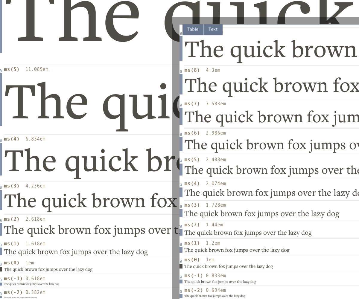
Experimenting with base and ratio parameters is a quick way to gauge how much proportional contrast is right for your project. Compare the following scales:
- The golden section (1.618)
- The minor third (1.2)
Due to their ratios, these scales have wildly differing degrees of change between each step. The “golden section” ratio yields much more change than the “minor third”. Consider how much change you’re likely to need, and how it correlates with varying screen sizes and content hierarchy.

The balance of typographic contrast in scale is dependent on screen size. A scale that works well on a large screen may have too much contrast for a small screen (and feel obtrusive). Likewise, a scale that is harmonious on a small screen may be too subtle when viewed on a large screen.
One solution to this conundrum is to create a scale intended for small screens that is also capable of adapting for large ones. The first thing to consider when creating that scale is which ratio to use.
| Step | Font size | Result |
|---|---|---|
| 0 | 1.0em |
Abcdefg
|
| +1 | 1.2em |
Abcdefg
|
| +2 | 1.44em |
Abcdefg
|
| +3 | 1.728em |
Abcdefg
|
| +4 | 2.074em |
Abcdefg
|
| +5 | 2.488em |
Abcdefg
|
The minor third ratio of 1.2 yields a gradually changing range of sizes. They all feel reasonable for small screens, and are distinct enough for levels of typographic hierarchy. At step #5, the resulting size can still be used while retaining a reasonable number of characters per line. With these attributes, this ratio feels like a good selection for small screen proportions.1
Applying your scale from the ground up
After figuring out a scale that works well for your project, you’ll probably want to put it into practice. CSS offers a few options:
- Copying and pasting numbers for a bunch of property values
- Using preprocessors like Sass with built-in math capabilities
- Using the native CSS
calc()function
The following examples employ option #3, using PostCSS in order to provide browser support for calc() and var(). If you prefer a different CSS processor, you can apply the same operations with that tool’s own arithmetic and variable syntax.2
For more complex modular scale applications, you should check out these plugins available for PostCSS and Sass:
They provide a cleaner syntax than calc() for getting scale values, and also support multiple values for base and ratio.
Configuring the variables
The first step is to define values for the ratio and base variables that much of the scale logic depends on:
:root {
  --ratio: 1.2;
  --base: 1;
  --base-em: calc(var(--base) * 1em);
  --base-px: calc(var(--base) * 16px);
}
Code language: CSS (css)
There are three base-related properties defined here. This is to provide flexibility when different CSS units (or no units) are needed.
Next, you need to establish the range of scale steps you’re likely to use:
:root {
  --ms0: 1;
  --ms1: var(--ratio);                    /* 1.2   */
  --ms2: calc(var(--ratio) * var(--ms1)); /* 1.44  */
  --ms3: calc(var(--ratio) * var(--ms2)); /* 1.728 */
  --ms4: calc(var(--ratio) * var(--ms3)); /* 2.074 */
  --ms5: calc(var(--ratio) * var(--ms4)); /* 2.488 */
  --ms6: calc(var(--ratio) * var(--ms5)); /* 2.986 */
  --ms7: calc(var(--ratio) * var(--ms6)); /* 3.583 */
}
Code language: CSS (css)
With these step properties defined, you can now compute them with your base to get values from your scale:
font-size: calc(var(--base-em) * var(--ms1)); /* 1.2em  */
font-size: calc(var(--base-em) * var(--ms2)); /* 1.44em */
Code language: CSS (css)Establishing default sizes
The browser default font-size paired with the scale step of 1.44 for line-height feels like an appropriate choice for body copy:
body {
  font-size: calc(var(--base-em) * var(--ms0));
  line-height: calc(var(--base) * var(--ms2));
}
Code language: CSS (css)
Headings probably don’t need to consist of six different sizes (as there are other ways to differentiate them). However, if you do wish to incorporate a different size for each, you can use a series of steps from your scale:
h6 { font-size: calc(var(--base-em) / var(--ms1)); }
h5 { font-size: calc(var(--base-em) * var(--ms0)); }
h4 { font-size: calc(var(--base-em) * var(--ms1)); }
h3 { font-size: calc(var(--base-em) * var(--ms2)); }
h2 { font-size: calc(var(--base-em) * var(--ms3)); }
h1 { font-size: calc(var(--base-em) * var(--ms4)); }
Code language: CSS (css)
In addition to heading font-size, you should also consider the values for line-height.
One of the most overlooked things in front-end development is the line-height of wrapped headings. They're often way too large
— Matt Stow (@stowball) December 4, 2015
Using a lower step of the scale in this case can benefit readability when lines are wrapping:
h3,
h2 { line-height: calc(var(--base) * var(--ms1)); }
h1 { line-height: calc(var(--base) * var(--ms0)); }
Code language: CSS (css)
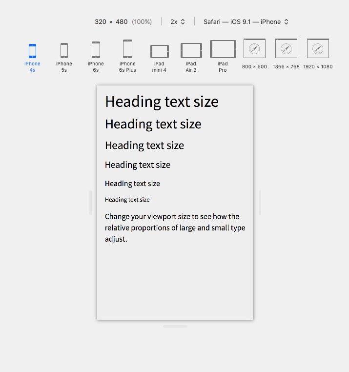
With these defaults for body copy and headings in place, you have a nice foundational hierarchy that works well on small screens:

Expanding your scale when proportional contrast is needed
Increasing screen sizes and viewing distances will reveal new typographic requirements for your layout. Your body copy and the contrast in scale of all typographic elements will likely need adjustments to suit the new context:
@media (min-width: 480px) {
  html { font-size: calc(var(--base-px) * var(--ms1)); }
}
Code language: CSS (css)
Bumping the global font size like this is a practical adjustment that requires little effort. While this practice is common, it’s worth noting that even small tweaks like this can leverage steps from your modular scale. Rather than incrementing the size by an arbitrary few pixels or a percentage, you can use your scale to determine the new value.
In line with amplifying your body copy, you might also want to increase the amount of change between each heading size. You can do this by overriding the larger headings with sizes from higher up your scale:
@media (min-width: 768px) {
  h3 { font-size: calc(var(--base-em) * var(--ms3)); }
  h2 { font-size: calc(var(--base-em) * var(--ms4)); }
  h1 { font-size: calc(var(--base-em) * var(--ms5)); }
}

@media (min-width: 1024px) {
  h2 { font-size: calc(var(--base-em) * var(--ms5)); }
  h1 { font-size: calc(var(--base-em) * var(--ms6)); }
}

@media (min-width: 1360px) {
  h1 { font-size: calc(var(--base-em) * var(--ms7)); }
}
Code language: CSS (css)
With these size adjustments in place, viewport width will determine how far up the scale your headings are allowed to climb:
(View the full CodePen to see how the text size responds.)
Broadening the usage of your scale
Limiting your scale’s influence to just specific elements would be highly illogical. You want flexible, abstracted styles to build complex interfaces with. Utility classes can provide that flexibility:
.u-textBigger {
  font-size: calc(var(--base-em) * var(--ms1));
}

.u-textSmaller {
  font-size: calc(var(--base-em) / var(--ms1));
}
Code language: CSS (css)
With one ratio relating all the text sizes, anything affected by these classes will adhere to the steps of your scale. Even when combining or nesting the classes, the resulting text will remain in relative proportion:
<div class="u-textBigger">
  <h2>Now I'm as big as an H1</h2>
  <h3>Now I'm as big as an H2</h3>
  <p class="u-textSmaller">I haven't changed at all.</p>
</div>

<div class="u-textSmaller">
  <div class="u-textSmaller">
    <div class="u-textBigger">
      <span class="u-textBigger">Same as it ever was.</span>
    </div>
  </div>
</div>
Code language: HTML, XML (xml)TL;DR
- Use a modular scale to define your typographic proportions.
- Create a scale that is flexible enough to work on many screen sizes.
- Use higher steps from your scale when more proportional contrast is needed.
- Don’t limit the use of your scale to specific elements.
Further reading
- More Meaningful Typography by Tim Brown
- A More Modern Scale for Web Typography by Jason Pamental
- Precise control over responsive typography by Mike Riethmuller
- Responsive typography with Modular Scale by Max Luster
- Modular Scale Calculator
- Golden Ratio Typography Calculator
- Gridlover
- Type Scale
Footnotes
- Using one base and one ratio isn’t the only way to arrive at a scale that works within small screen limitations. You can also create a multi-stranded scale by using multiple base or ratio values instead of just one. Here is an example using a secondary base value to shorten the distance between each step. See modularscale.com for a better explanation.
-
The postcss-cssnext plugin can be used to transform the output of
calc()andvar().
